A 5 year transformation
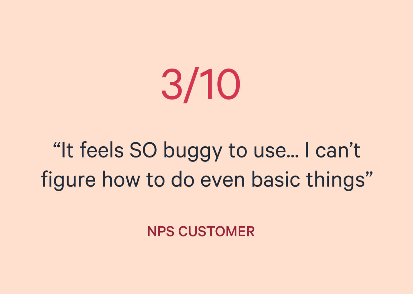
In early 2017, Qwilr’s NPS was withering from a conceptually novel editor, that was struggling to deliver on it’s promise. Working with content was confusing, unpredictable and buggy. — not just from other tools, but from within the editor itself.
Over 5 years, I lead the editor’s transformation from a nascent offering, to a sophisticated market differentiator. A journey I started as an IC, and ended as a leader. This graduation of roles allowed me to explore a deeply challenging space from multiple vantage points, and I’m incredibly proud of the impact and attention to detail achieved during this time.
2017 – 2018
Redesigning the foundations

Me
Defined and designed all editor behaviours so they were intuitive, consistent, and scalable.

Ravi
Engineer, responsible for the engineering side of the rewrite, and helped definiing core behaviours.

Ben
Engineer, lead the rewrite project and migrating to Slate, and collaborator on core behaviours.

Marcin
Advisor, bringing expertise from his role at Medium, to sharpen our approach and behaviour definitions.
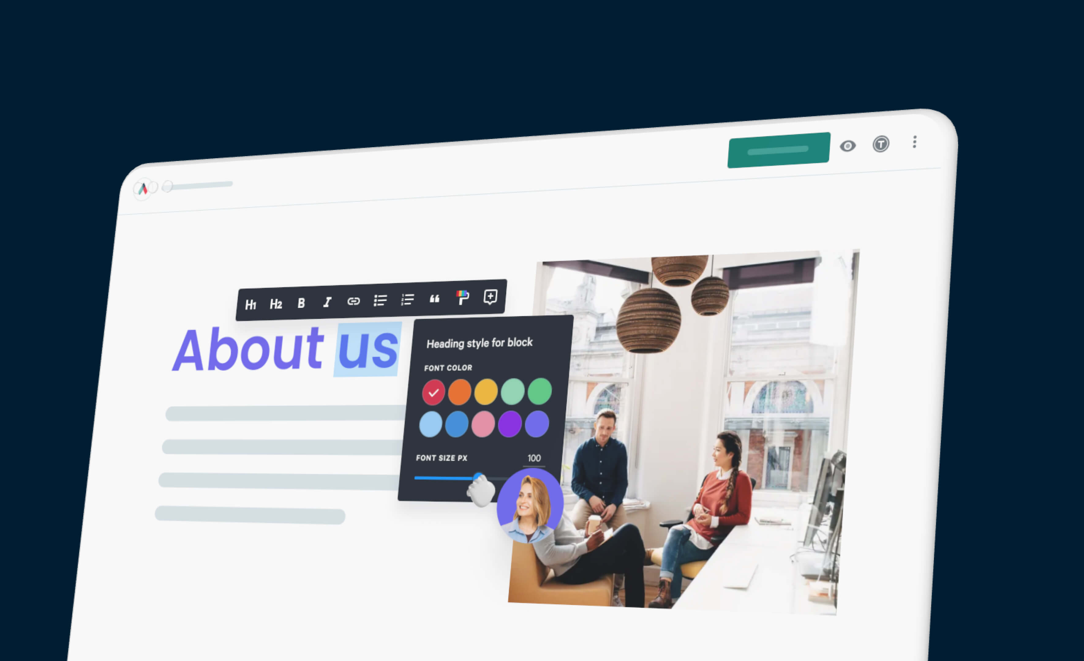
Qwilr was a fully WYSIWYG editor, and while it had visually simple UI, it was frustratingly unclear and unreliable in use. A legacy codebase made fixes unbearably slow, especially without a clear picture of how everything should work together. We started over, committing to a full rewrite and redesign of the editor from the ground up.
Challenge
Inconsistent, to intuitive
At this stage, there was less than a dozen full time employees at Qwilr, and customers tended to be solo founders, companies of one, or tiny agencies. Resource strapped, but eyeing up a move to mid-market, the editor simply wasn’t at a standard to compete at a higher price point.
Approach
Back to first principles
The previous editor suffered from a lack of clarity on how it should all work together. When to follow the conventions, when not to, and why. Reflecting on this, I started by writing down principles for the type of editor we wanted to create.
- Enable focus
- Optimise for flow
- Match intentions
- Reward play
Harmonising behaviours
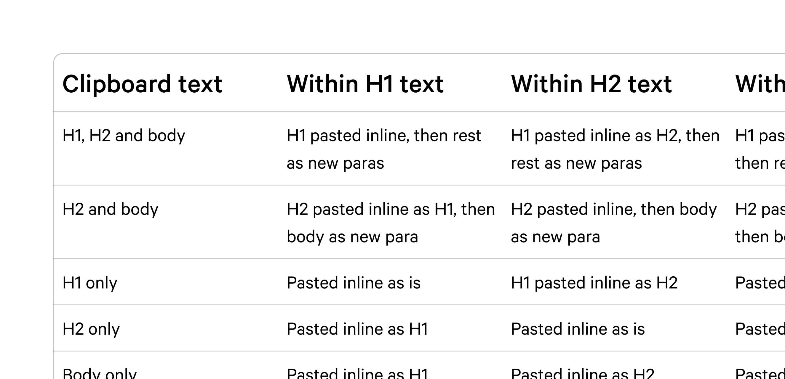
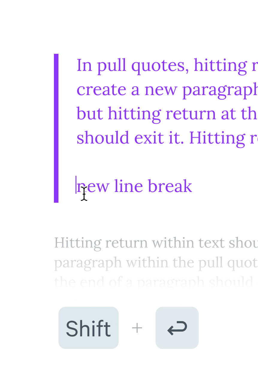
Guiding principles in place, I set off researching the minutiae of how the best editors worked. How they handled formatted text from the clipboard, keyboard shortcuts, re-ordering content, and more. Making note of what felt smooth in use, what felt rough, and comparing this to how the existing editor behaved.
I found that the best editors were the result of countless small and thoughtful details. Details that worked in harmony, but often felt invisible in use. To create a shared language in the team, I wrote new definitions for every behaviour and action you could take in the new editor. What the desired outcome should be, and why. Part north star and part spec, this became a touchstone during the project, and a foundation to build off for years to come.
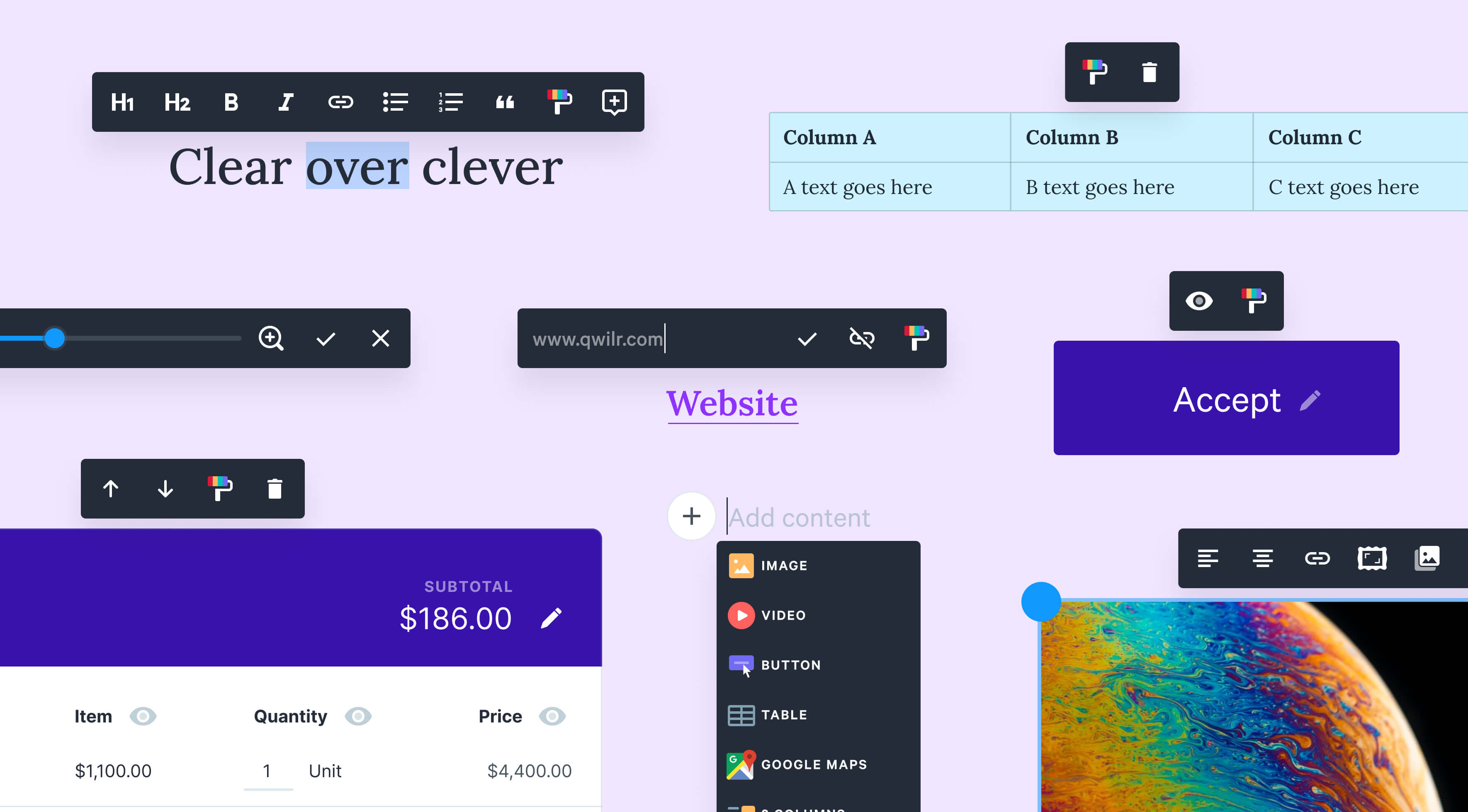
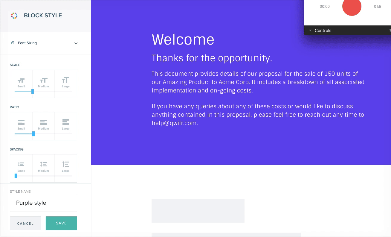
Streamlining controls
In the old editor, each element had a different ways to select, resize, restyle and even delete — a problem compounded by visually inconsistent controls. I wanted to make working with any element in the editor more discoverable, simpler, and more consistent. I redesigned all controls to have a sharper focus on accessibility, and designed them in a way that could scale with our upcoming feature. The first building blocks of Kaleidoscope, Qwilr’s Design System.
2018 – 2019
Turning styles into a core strength
Me
Lead the discovery, redesign, beta testing and launch of the feature redesign.

Yundi
Engineering Lead, building out core functionality in the redesign, and point person for beta changes.

Mike
Engineering Lead, designing the underlying data model of styles so it was robust and scalable.

Janine
UX Writer, responsible for how the feature was framed and referred to, from first concepts to launch.

Annie
Designer, helping finalise the style library concepts, and save styles flows.
As Qwilr moved upmarket, 35% accounts were churning because of limited styling features. We’d fallen behind competitors, and needed to take a big swing to reduce the churn. I lead the team through a full feature redesign (twice), to turn styles from a major churn contributor, to a core competitive strength.
Challenge
Imprisoned by presets
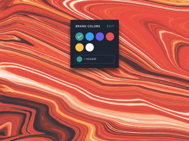
Qwilr pages are made up of sections called “blocks”, which had unique functionality (e.g. a “block” for quoting, a “block” for embeds). Style presets for these blocks were created from simple brand settings of the account; primary colour, secondary colour, and brand fonts. As most Qwilr customers have little to no design literacy, the goal is to enable good design outcomes, with minimal effort or thinking by the user.
These presets helped ensure a relatively good outcome, but were frustrating in use. Table stakes features were missing, the outcomes possible were too constrained, and customers didn’t feel like it was a good reflection of their brand. Users couldn’t even delete the presets they didn’t like.
Approach
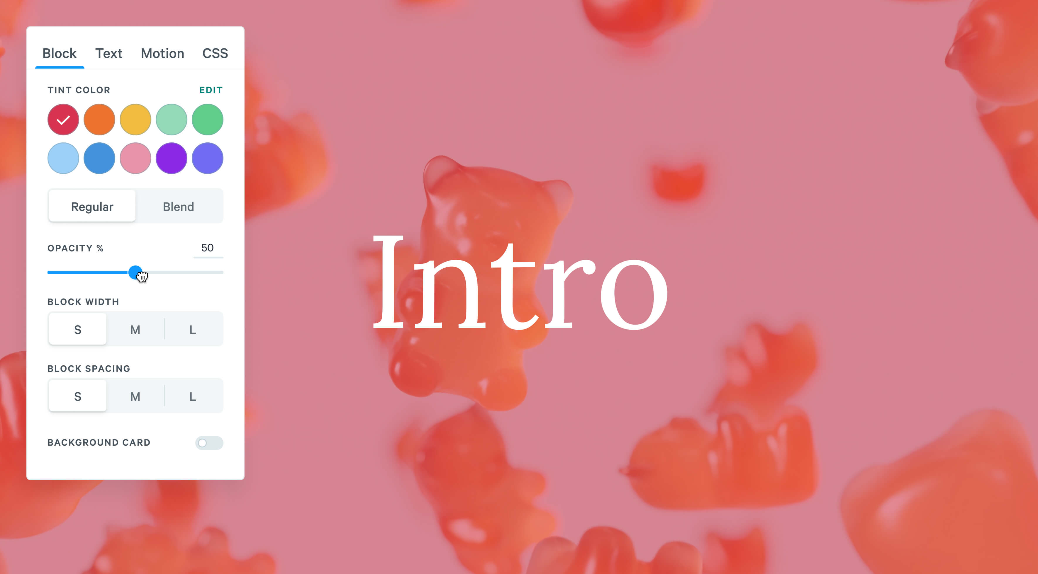
Compound controls
The first redesign mapped multiple values to one slider, to give users control, but keep the outcome in harmony. While it felt fun to use, these sliders lacked specificity, and felt unfamiliar. Customers couldn’t understand the relationship between the interface and the outcome they wanted to create.
We’d also made a tradeoff to ship sooner, and put all of this into an overlay — an overlay that obscured the content they were trying to style. This resulted in a lot of back and forth to get a simple outcome, forcing customers to keep a lot of this mental mapping in their heads. It was, by all accounts, a failure, and a painful lesson in being clear over clever. Not only was it trying to be too clever, it wasn’t clear exactly who it was solving for.
Empowering the extremes
Through user interviews post launch, I discovered two extremes I had failed to design for. One had a very defined brand, and wanted to quickly set it up in Qwilr, and prevent people going off piste. The other didn’t have any defined brand, but wanted it to look like they had, and wanted the freedom to tweak in context. With this clarity, we embarked on another redesign, taking the time to write up north stars for the experience:
- Minimise time to setup an existing brand
- Leverage style shortcuts for speed
- Minimise friction for changes in context
- Empower brand owners & brand users
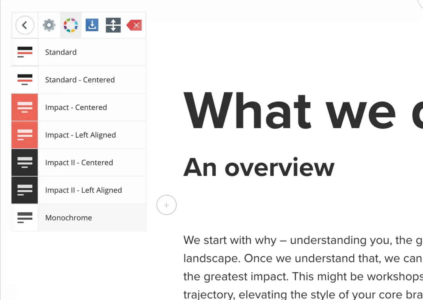
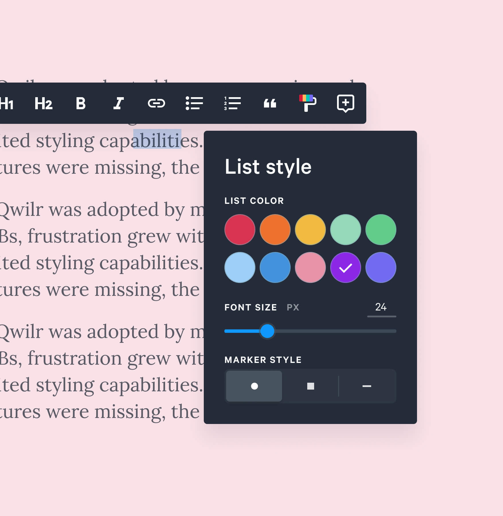
I lead another full redesigned of the feature; leading a team through betas, dogfooding and launch. The resulting suite of styling features, internally called “Technicolour Dreamcoat”, focussed on simple, direct and empowering controls. An enormous effort , and a triumph of cross-functional collaboration, we launched again, and finally delivered something customers loved — dropping styles as a churn contributor from 35% to just 5%.
2020 – 2022
Widening Qwilr’s moat in the market
Me
Design Director, responsible for setting direction, running workshops, and high level concepts.

Hamish
Designer, responsible for prototyping out interactive concepts, and leading feature projects.
Annie
Designer, responsible for prototyping out interactive concepts, and leading feature projects.

Mitch
Engineer, key collaborator in developing concepts and delivering high quality experiences.

Drew
Engineer, key collaborator in developing concepts and delivering high quality experiences.

Sarah
Engineer, key collaborator in developing concepts and delivering high quality experiences.
Where competitors had verbatim taken traditional “old world” document tools online, Qwilr’s advantage was being uniquely web first. During my last few years, I lead a series of teams to exploit this advantage, creating features our “old world” competitors would never be able to copy.
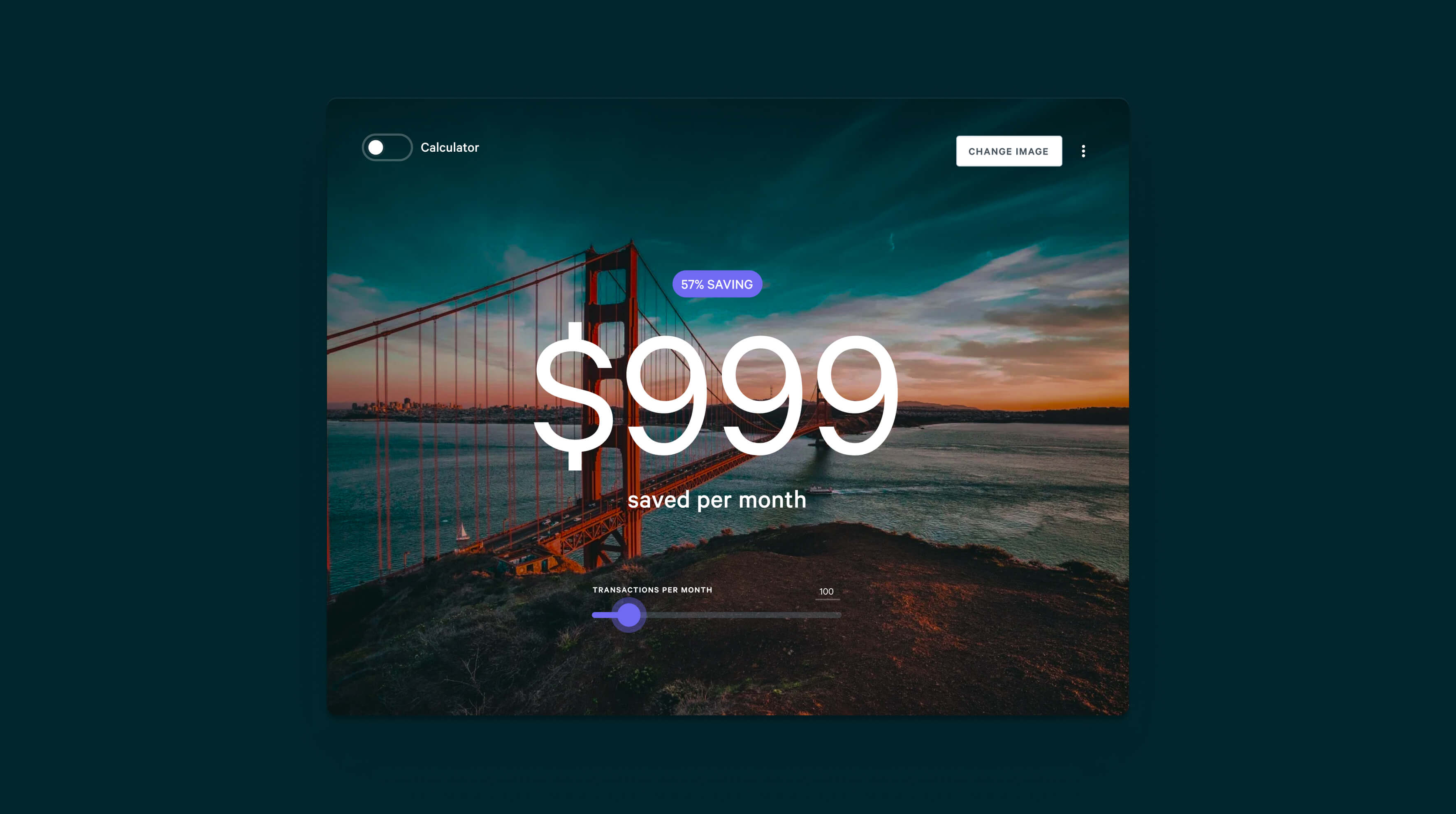
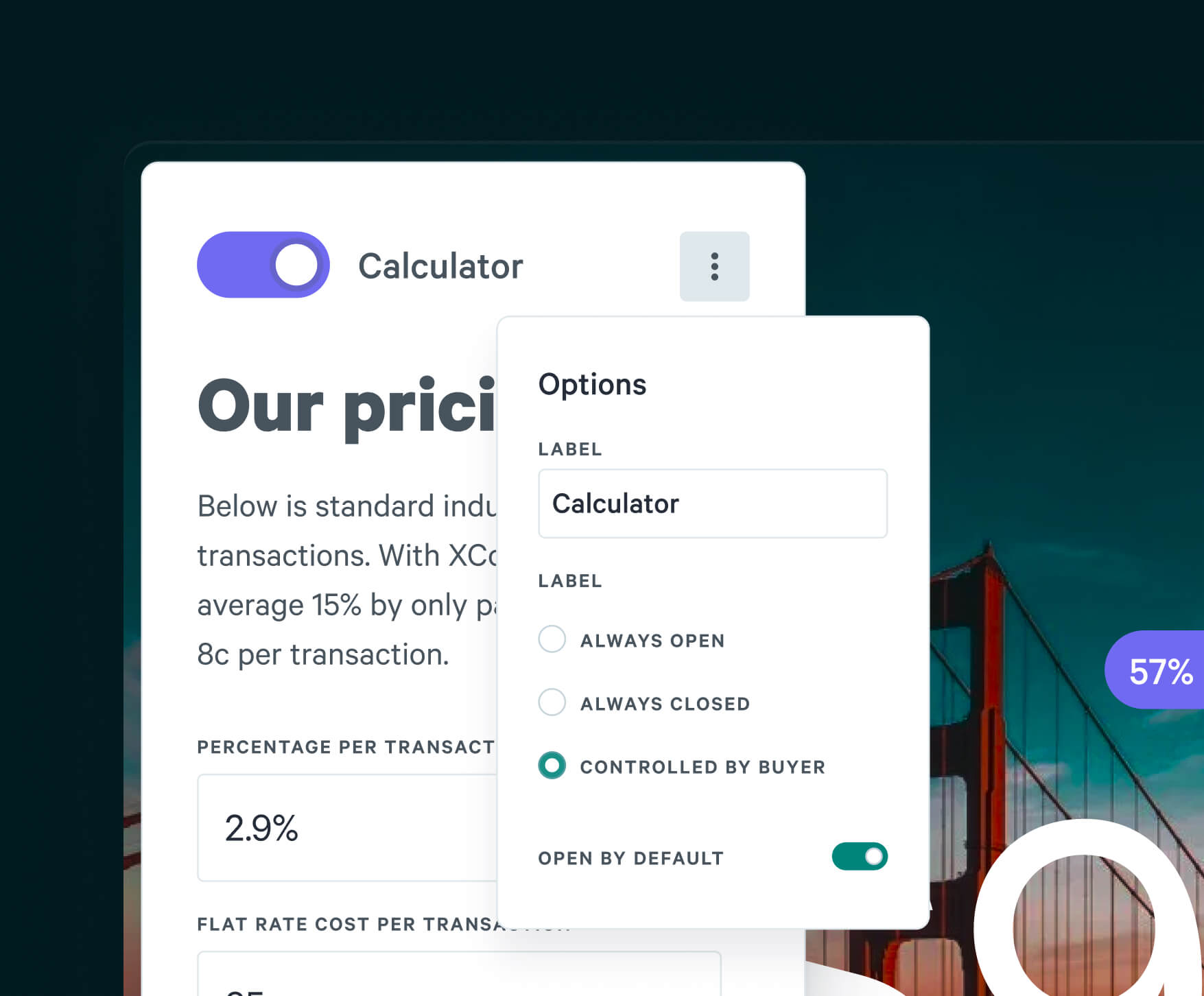
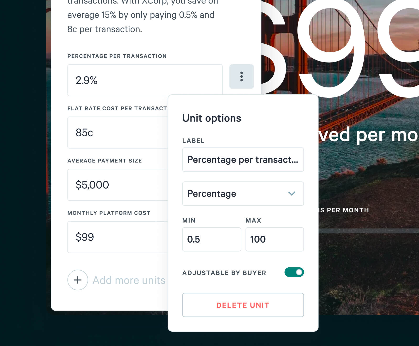
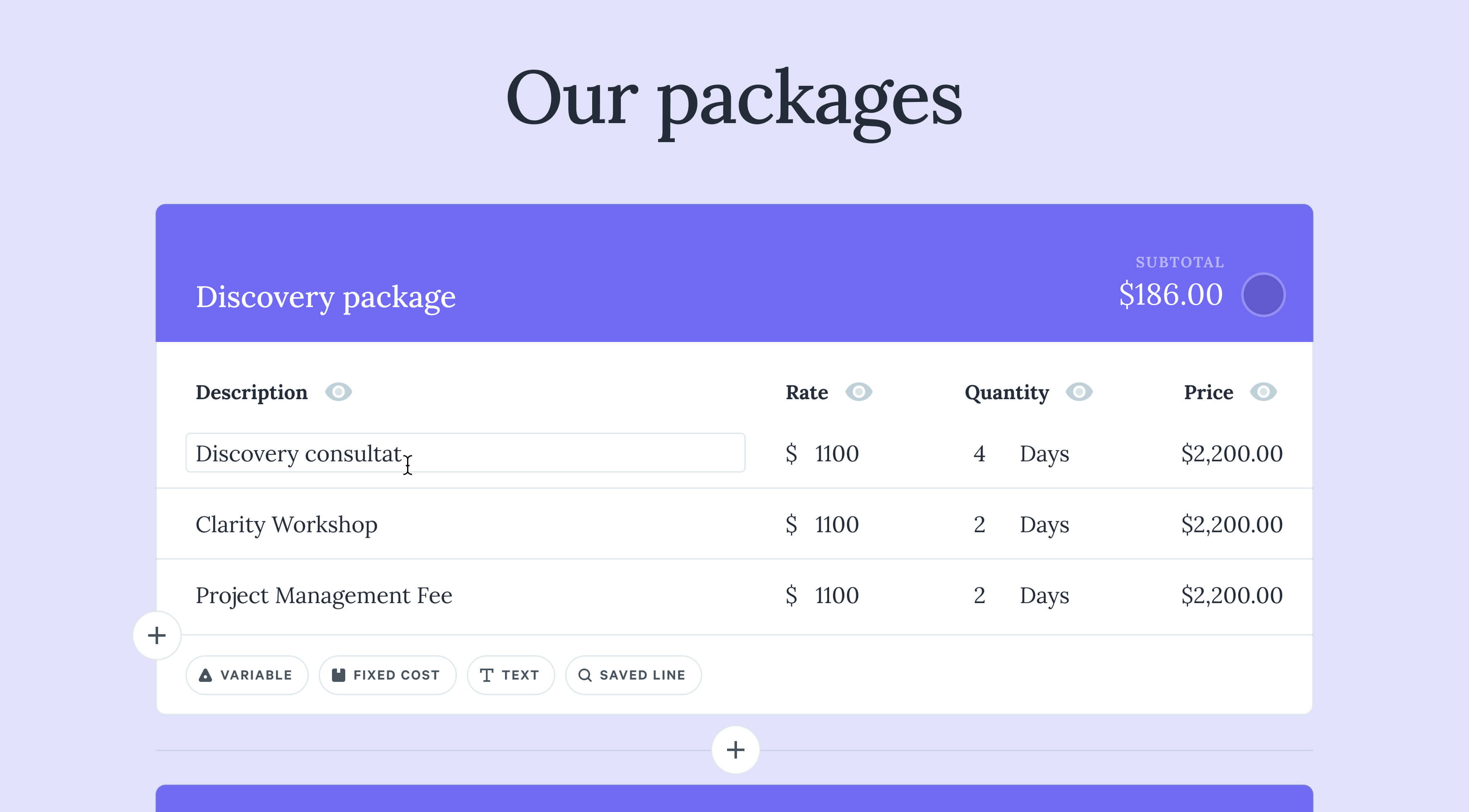
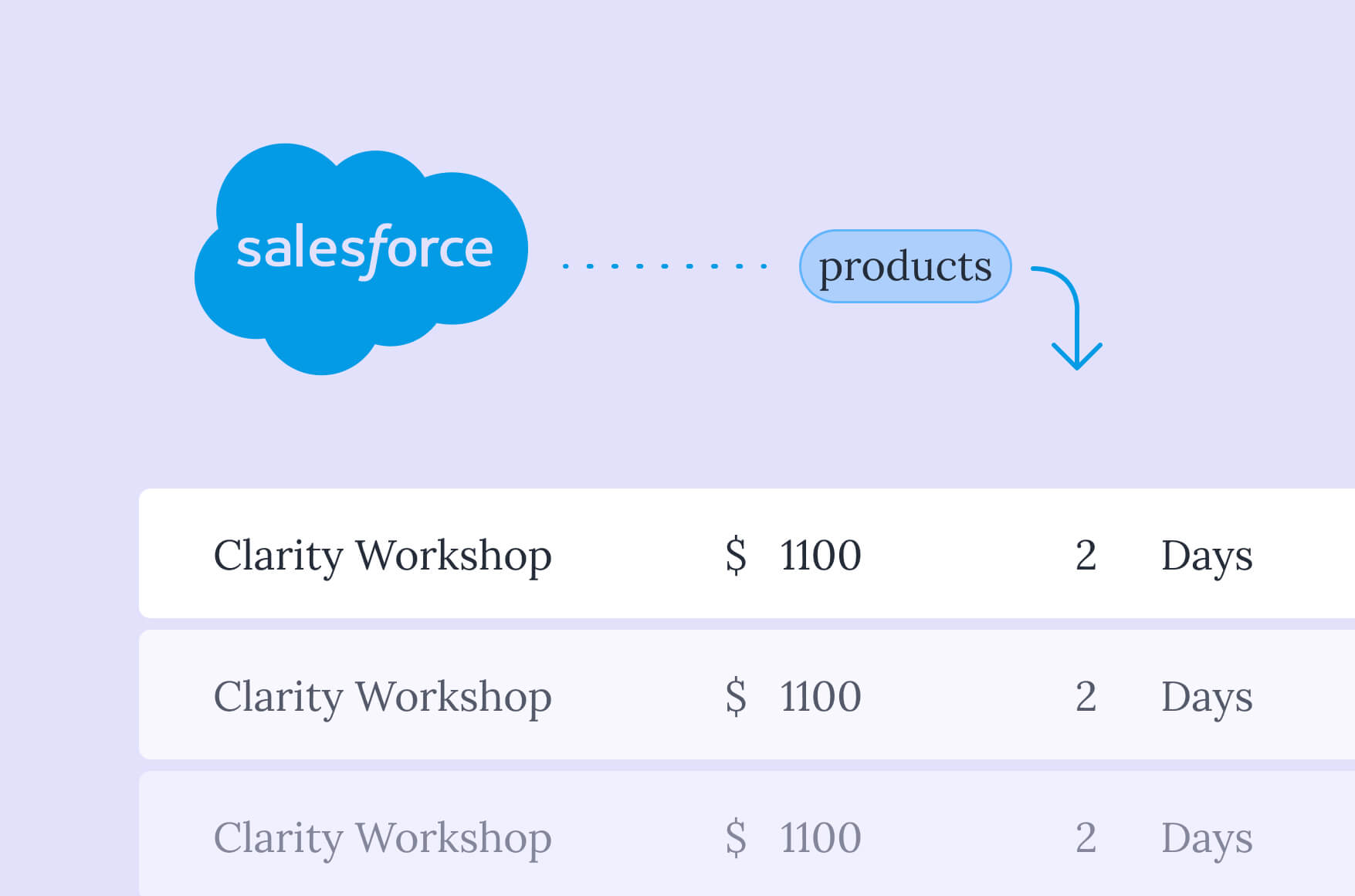
Empowering the buyer
Most of Qwilr’s customers relied on an integration to get pricing data from their CRM into a Qwilr Page. Initially designed for simple services businesses, I lead an early redesign to make these more dynamic, interactive, and smarter with how they pulled information from the CRM.
Later as VP Design, I lead teams and designers to transform these areas into new experiences that empowered our customer’s buyer. New core functionality, more powerful CRM integrations, and a suite of usability improvements that delivered market firsts, and a huge competitive strength.
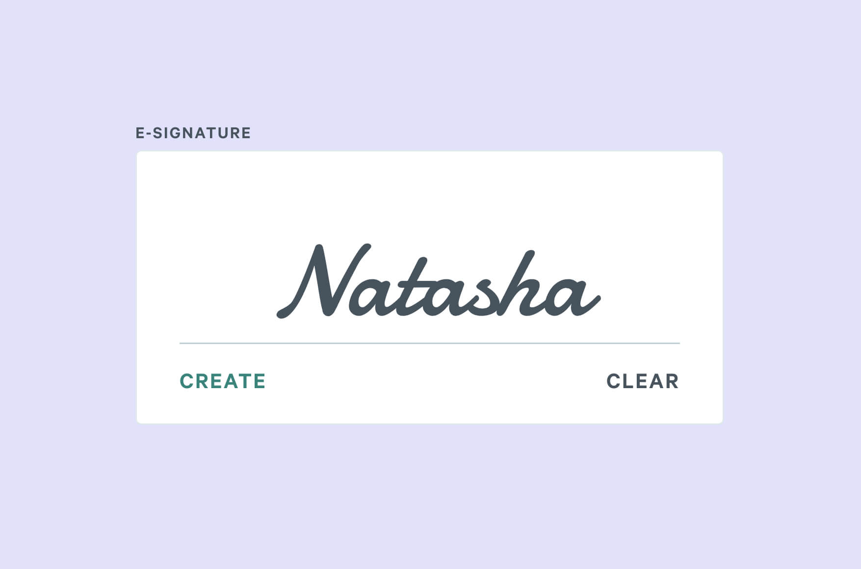
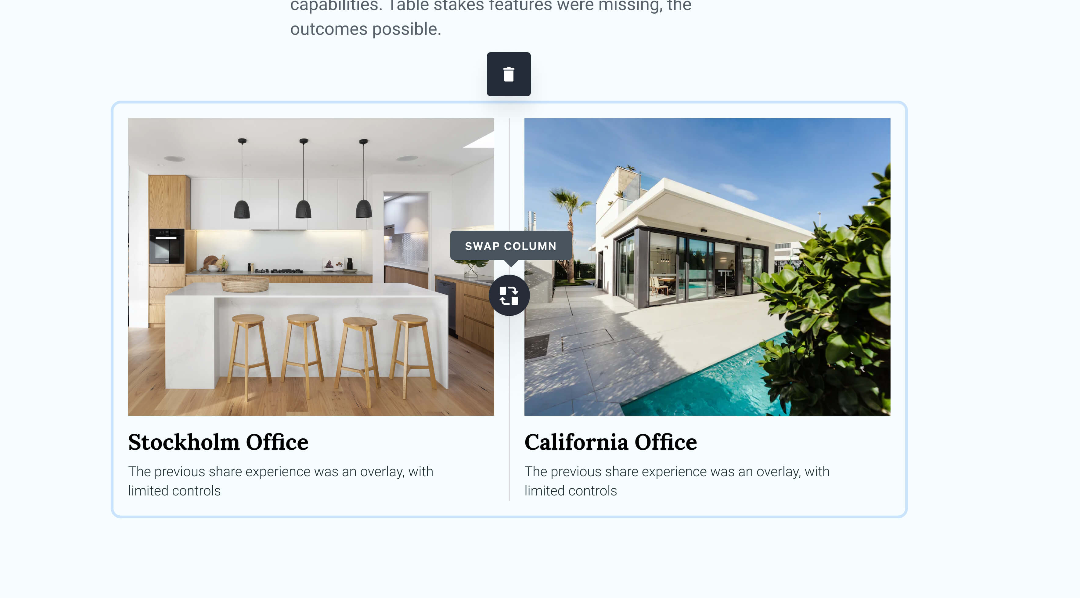
Unlocking new use-cases
Over several years, I lead design, projects and teams to create a suite of new layouts and interactive components in the editor. I spent my time creating high level proof of concepts, ensuring strategic alignment, look and feel across teams. Below are a few favourites.