Creating a shared focus for the work

Me
Creative Director, leading workshops, disovery and explorations of early brand concepts.

Chris
Head of Marketing, helping shape goals of the rebrand, and how it fit into the broader marketing strategy.

Tania
Product Marketing Lead, ensuring alignment with GTM messaging, and early concepts for upcoming campaigns.

Aaron
Demand Gen, helping understand viability of certain concepts with top of funnel marketing activties.
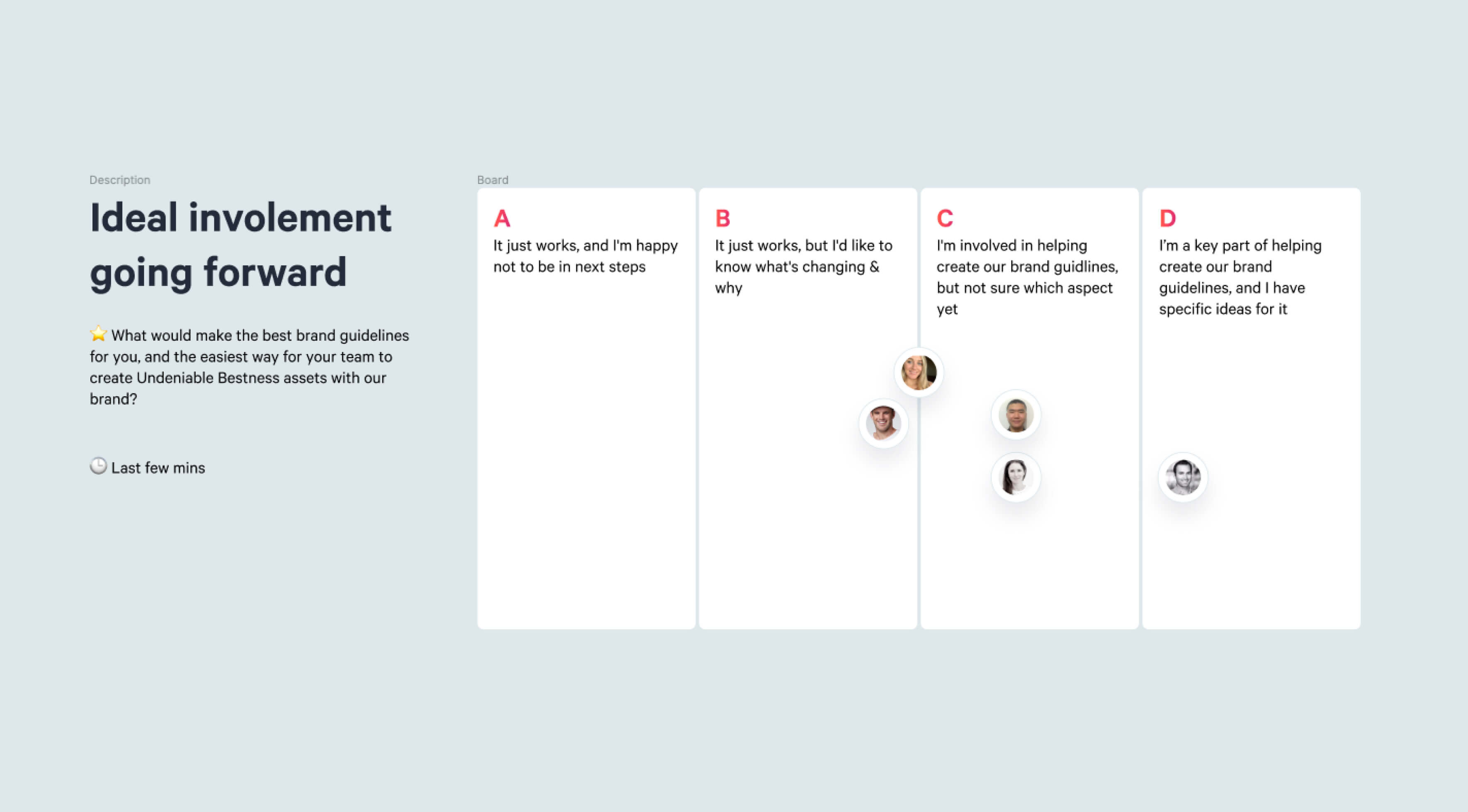
Qwilr’s headcount had grown, and with it brought more stakeholders, users and exciting use cases for the brand. To make this rebrand a success (both internally & externally) I wanted to involve departments early in the process, so we could understand what we all needed, and create shared goals to align our efforts around.
Challenge
A sprawling patchwork
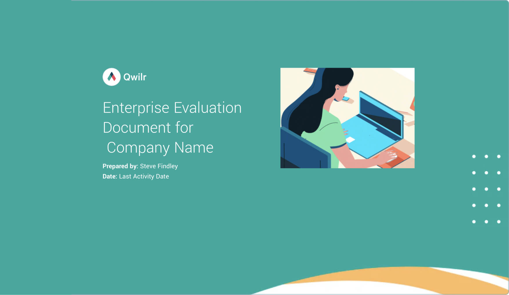
The existing brand was suffering from a lack of direction, both visually and strategically. Each area had it’s own style, without the grounding of a broader narrative. In an effort to get work out quickly, the dreaded amorphous blob had been deployed, as well as stock images, colours without intentionality, and outdated product shots and styles. Worst of all, there was no distinction between our brand and the customer’s brand. Making it hard for customers to visualise their own success in the product.
Approach
Co-design workshops
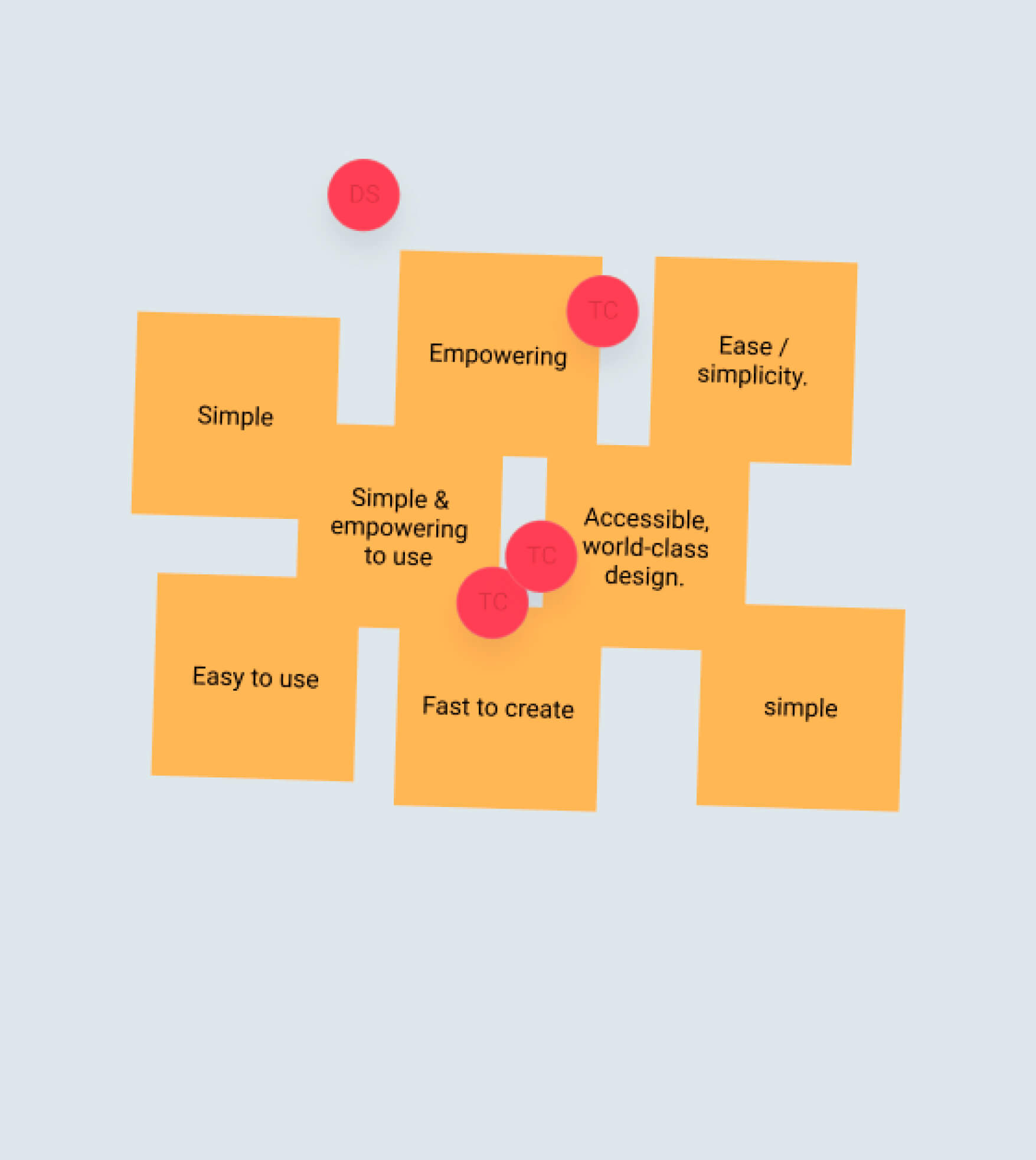
Three key themes emerged early on in discussions. How could the brand be easier to use? How could it have a clearer point of view in the market? How can the brand be more empowering than policing? To co-design the outcome to these questions, I brought in key perspectives through a series of workshops. Helping create a shared understanding of what we all wanted, and really needed, to focus on with our limited resources.
Finding our differentiator
Me
Creative Director, leading explorations, prototyping concepts, and driving internal feedback & alignment.
Tania
Product Marketing Lead, and a key partner in the new brand. Helping develop and refine concepts throughout the process.

Hamish
Senior Designer, developed core 3D assets and animations, helping develop and refine all brand concepts.

Charl
Designer and artworker, helping build off Hamish's 3D work, and rolling out concepts across touchpoints.
Building off of the workshops, we needed to get to the core of what made Qwilr unique in the market. Visualised so it was clear, engaging and resonated with the progress our customers wanted to make. Leading a broad visual exploration, we finally zeroed in on what made Qwilr unique — the user relationships at the core of the product.
Defining brand values
At the core of Qwilr, are sellers creating a page to send to their buyers. Once sent, a Qwilr page becomes a shared surface; can be interacted with, collect analytics, and enable transactions. The more we explored visuals, the more we realised how simple but powerful this concept is to the brand. From how we use colour to signal a “buyer”, to our new brand values:
- Transformative — In how Qwilr feels to use
- Compelling — visually to create, and to receive
- Empowering — For the seller and for the Buyer
Emphasizing interaction
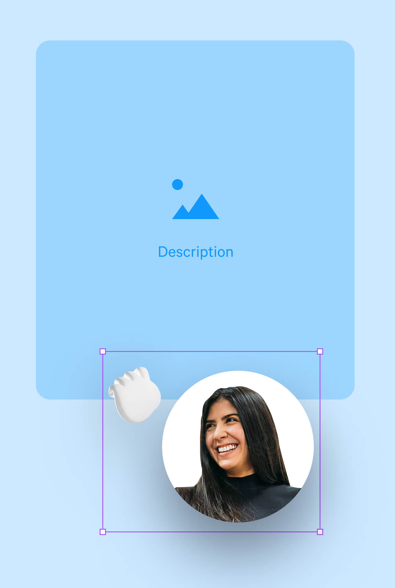
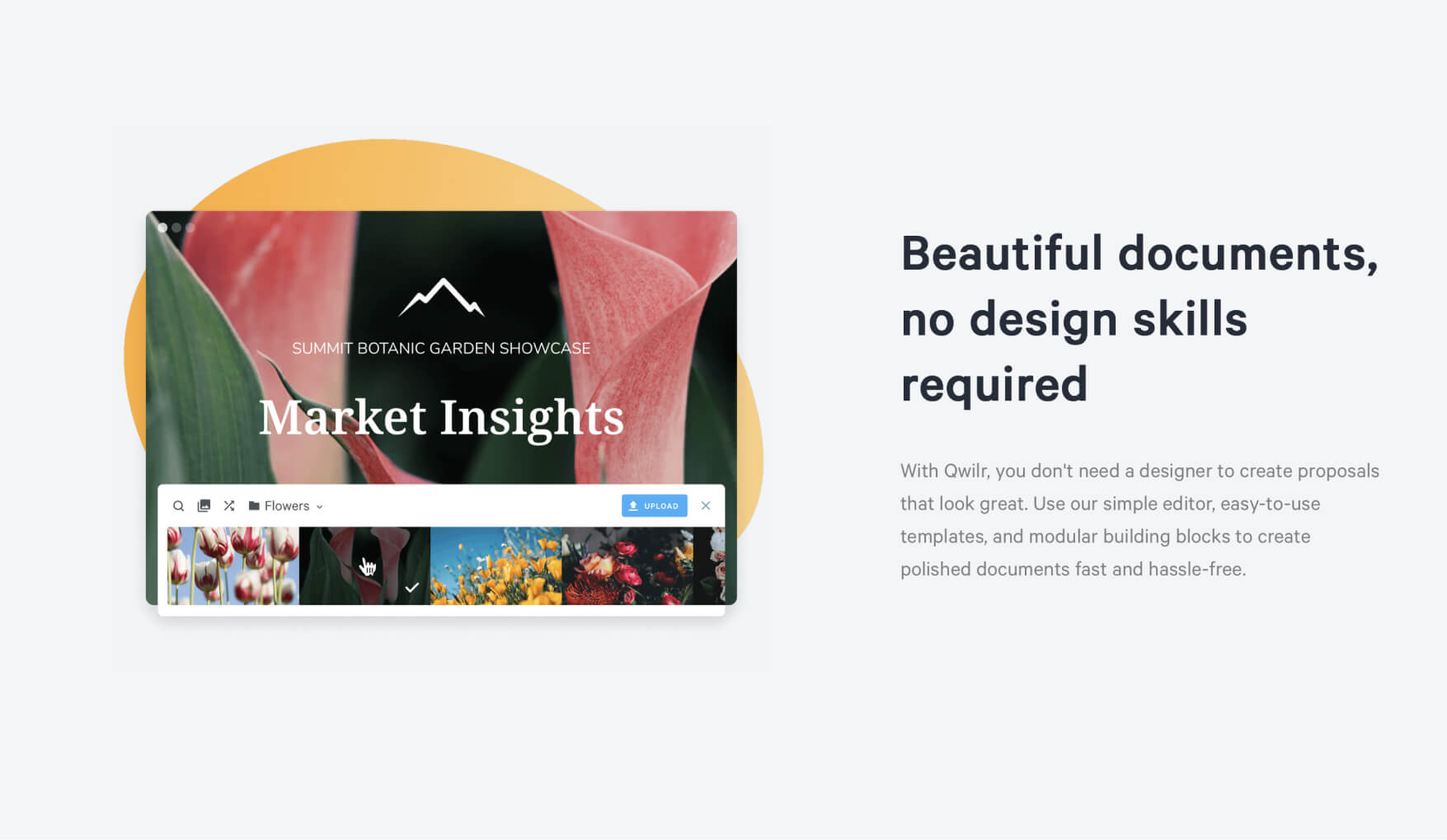
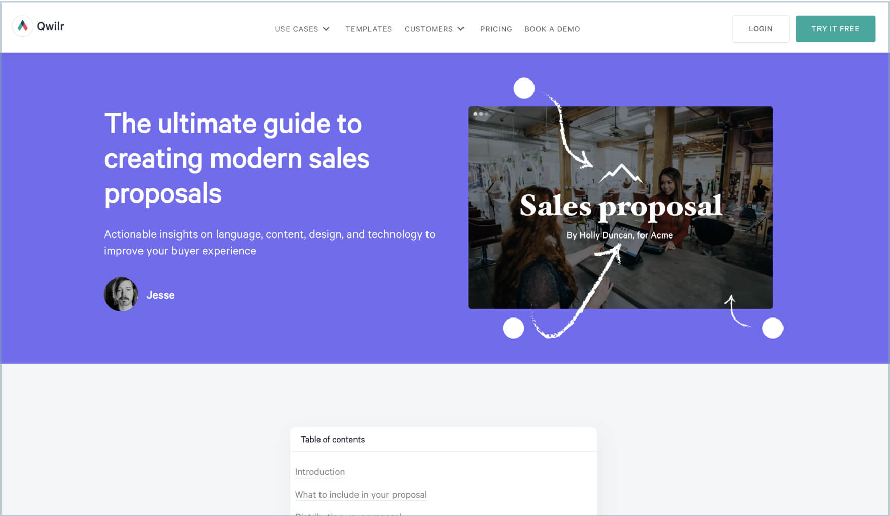
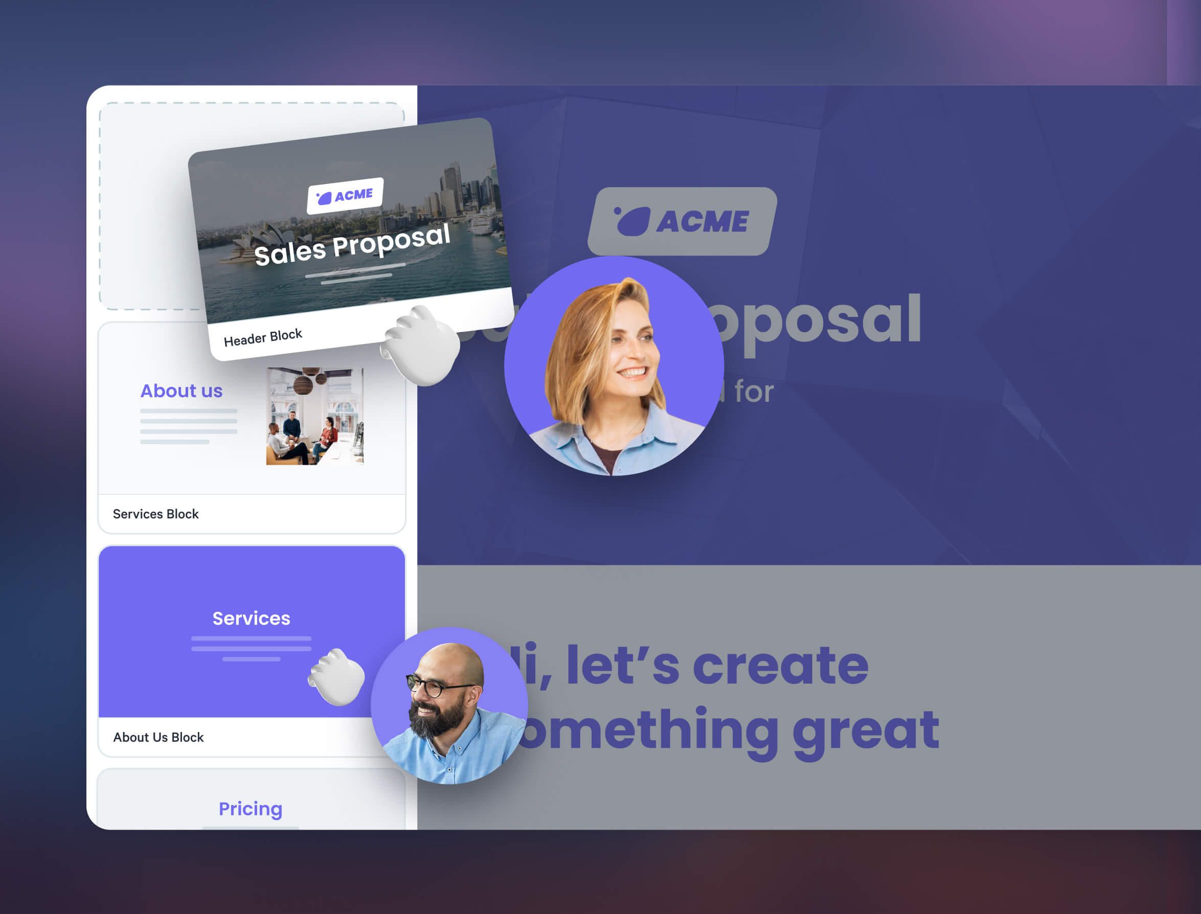
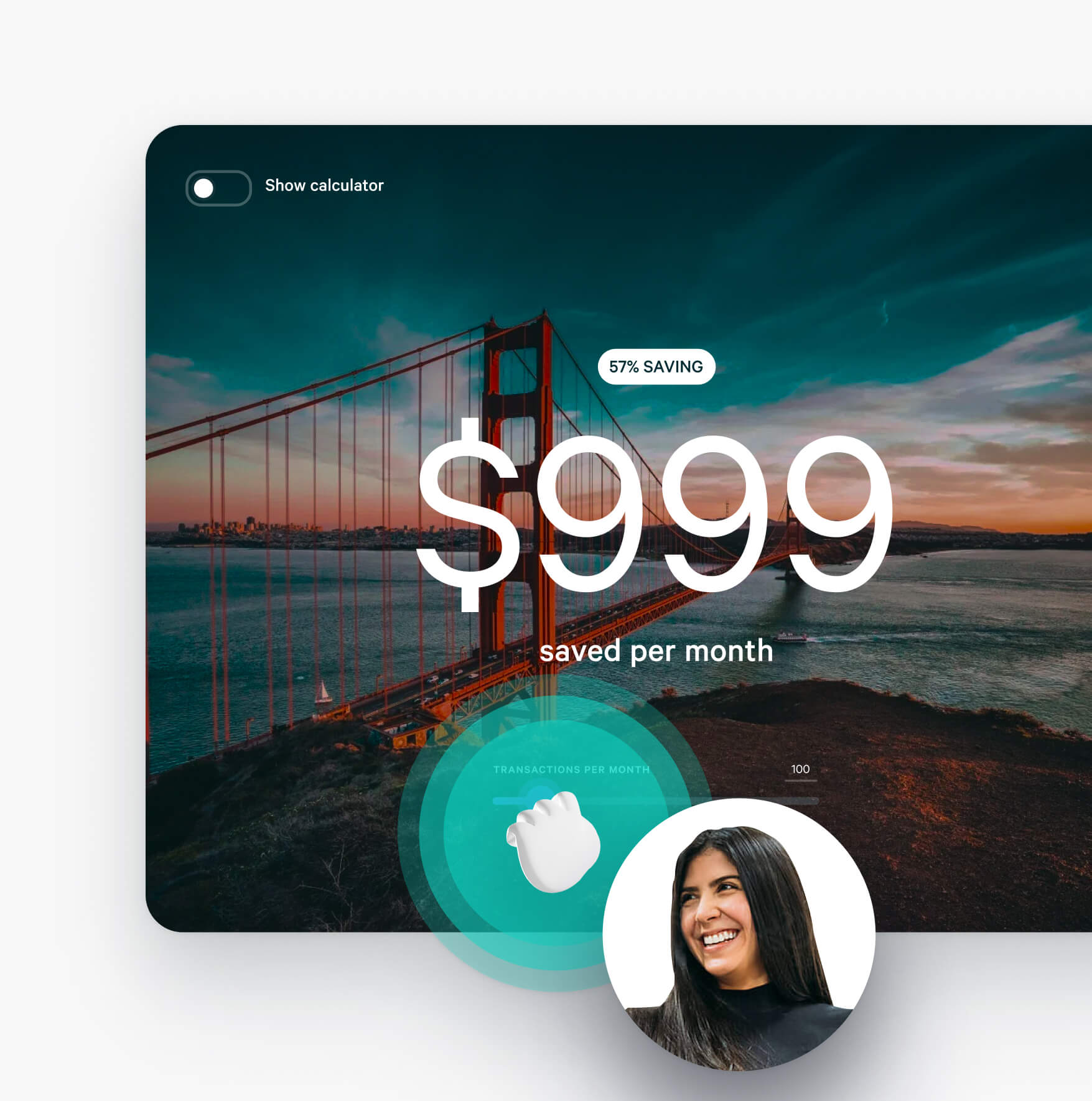
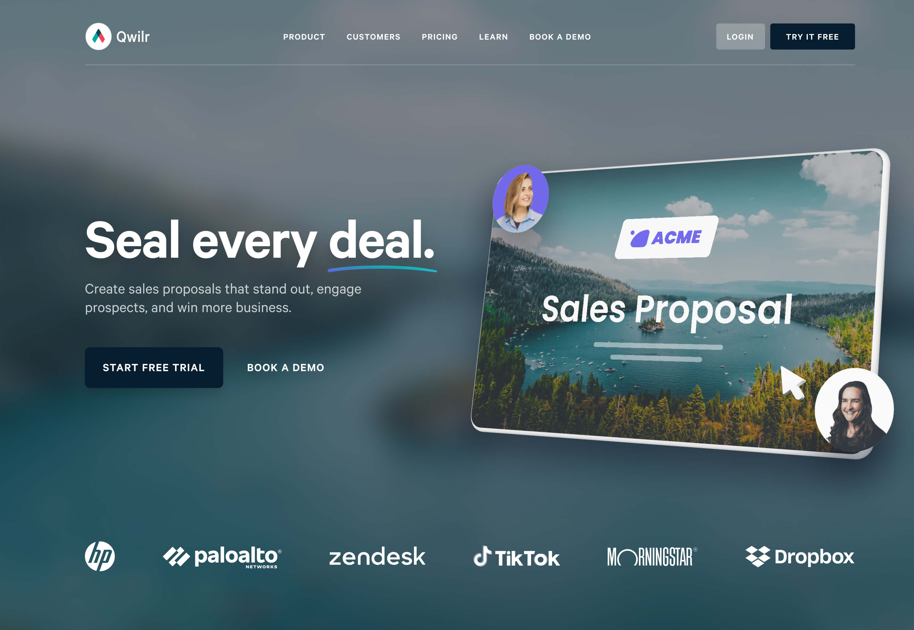
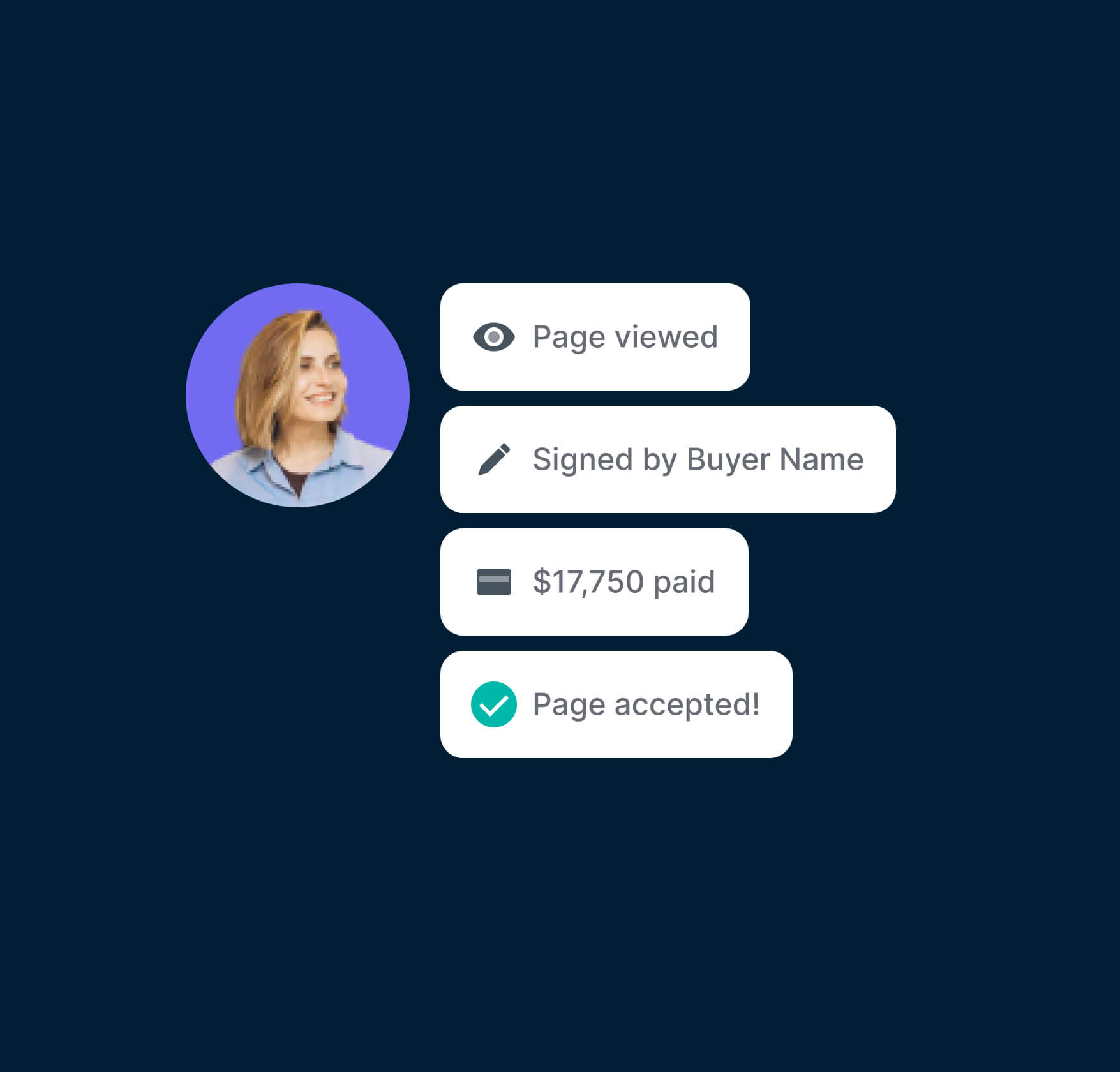
Competitors were still mostly platforms for creating PDFs online, and our biggest differentiator was being uniquely web first. A benefit not just to the users of our platform (called the “sellers”), but to the audience they’d send their pages to (the “buyers”). I needed a way to visualise this difference to customers, and even when applied to different styled Qwilr Pages, still look and feel like Qwilr.
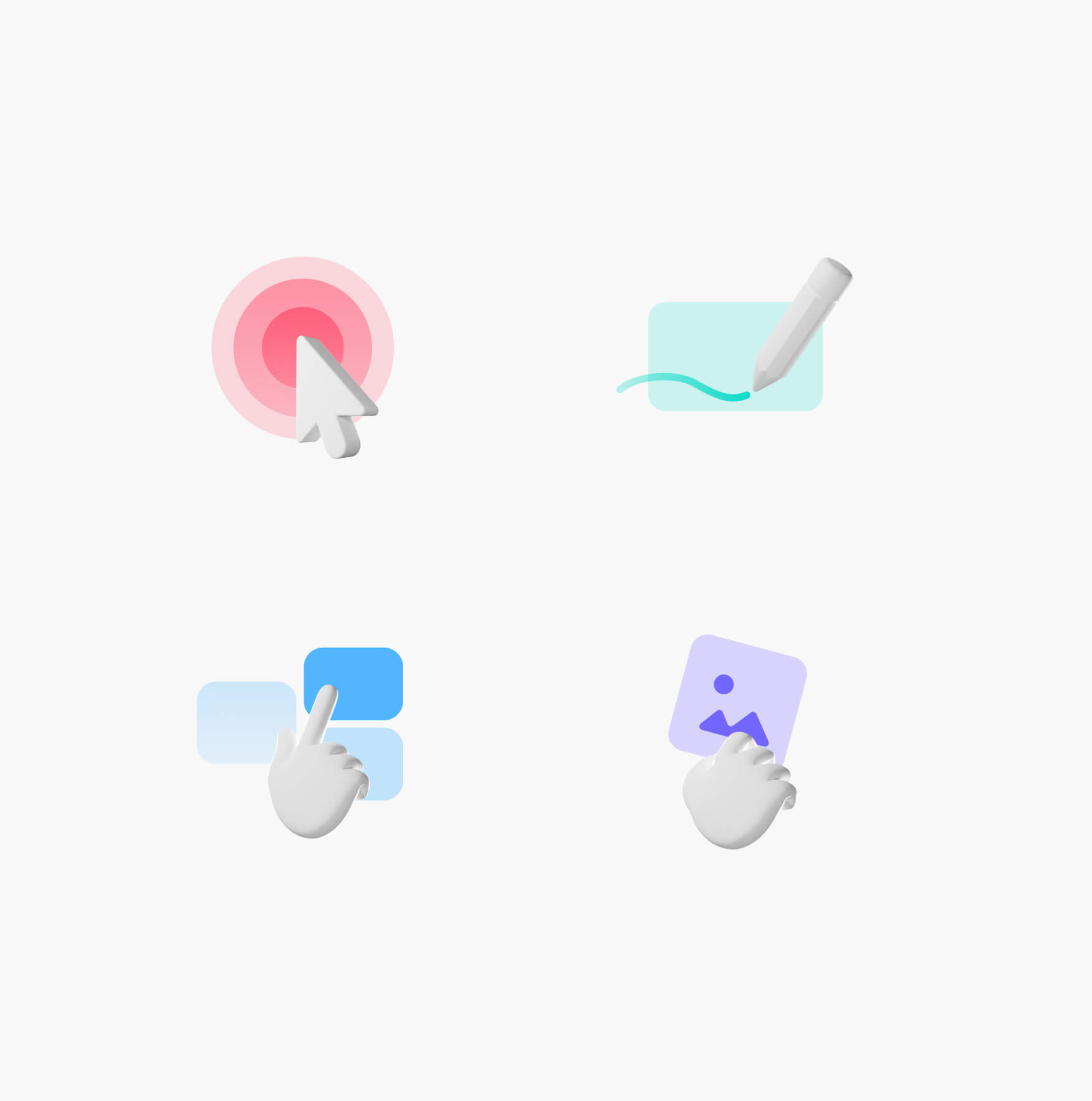
After exploring different concepts, we found that “emphasizing interaction” was not only a great theme for high impact visuals, but a way to visualise the cause and effect of the “buyer” and “seller” relationship. After creating some primitive explorations in Blender, I worked with the team to create a series of oversized cursors, and visual patterns for how they interacted with the page. These struck a balance between being accessible, but not cartoonish.

Visualising JTBD
Bringing all this work together gave us a flexible framework for creating feature narratives, and visualising our customers JTBD. From getting a notification the first time a page is viewed, explaining key concepts in the product, to the moment the buyer signs on the dotted line. Always highlighting how Qwilr improves the buyer & seller relationship.

Creating assets that empower
Me
Worked with the marketing team to understand what they needed, and created the brand system in Figma, Qwilr and on the marketing site.
Tania
Product Marketing Lead, helped come up with ideas for the library, then road test and iterate it so it was fit for use.
Hamish
Build out the library on Kaleidoscope, as well as refining some of the components in Figma and the marketing site.
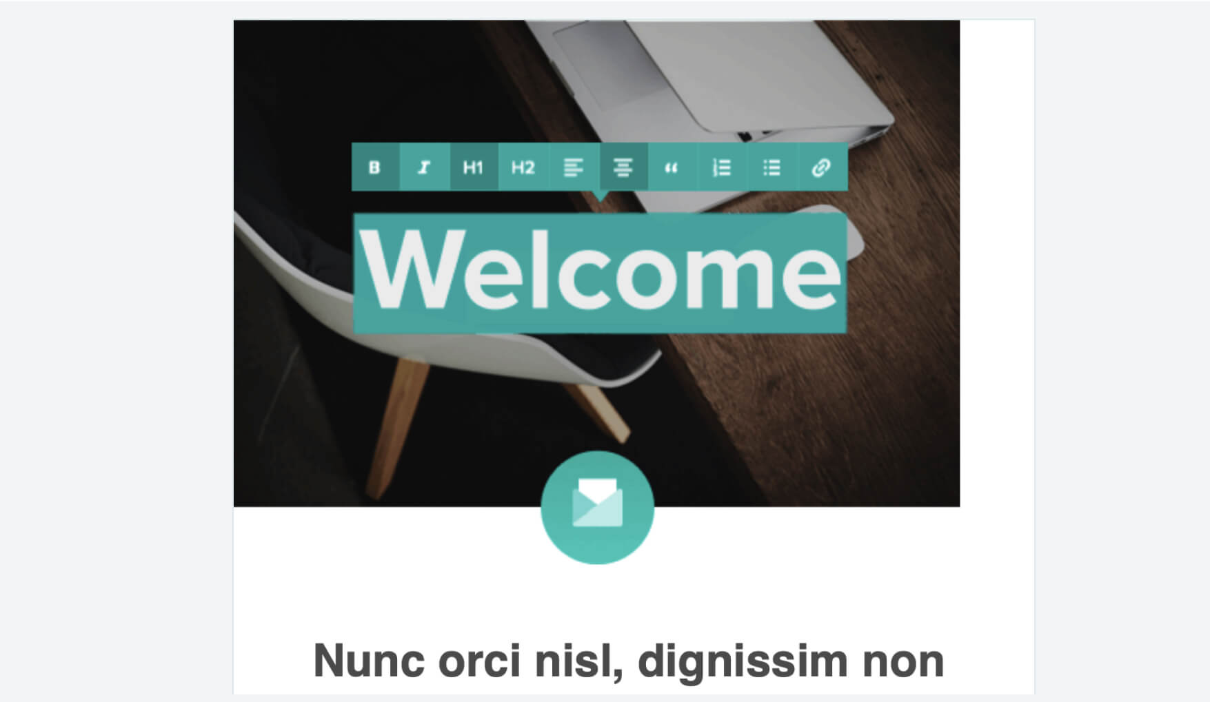
To maximise our limited resources while still supporting a wide range of brand assets, I wrote a Brand Book. To contextualise the “how” of templates with the “why” behind our decisions. Enabling teams to work with the new brand quickly, while ensuring good design outcomes.
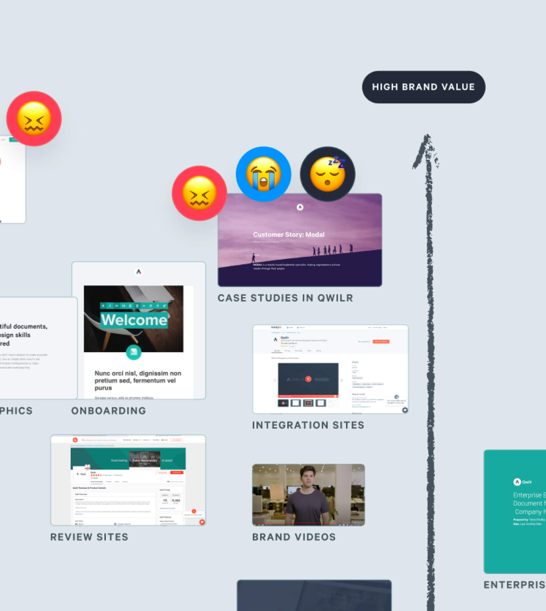
Wireframing to launch
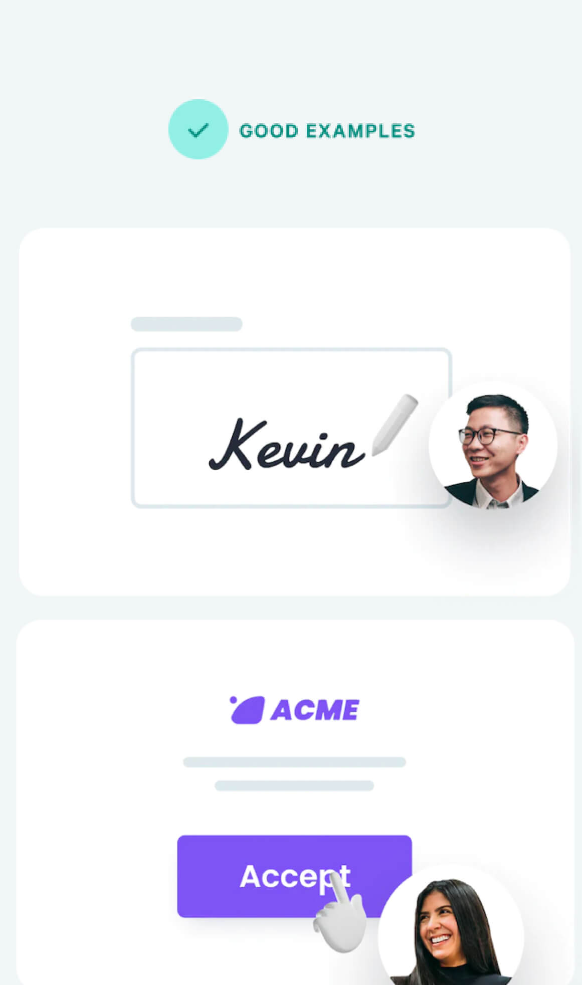
We focussed most of our efforts on the two biggest bottlenecks in getting Marketing work live; fleshing out the layout of pages, and creating assets to support them. Aiming to improving speed while minimising the tradeoff on quality, I create a series of templates, components and ready to use assets for the teams in the Brand Book. To make it easier to explore new ideas quickly, and enable teams to launch new brand assets without endless cycles of sign offs. Some examples include:
- Marketing site components to build landing pages faster
- Figma wireframe kit that matched the above
- Figma components for teams to create their own avatars
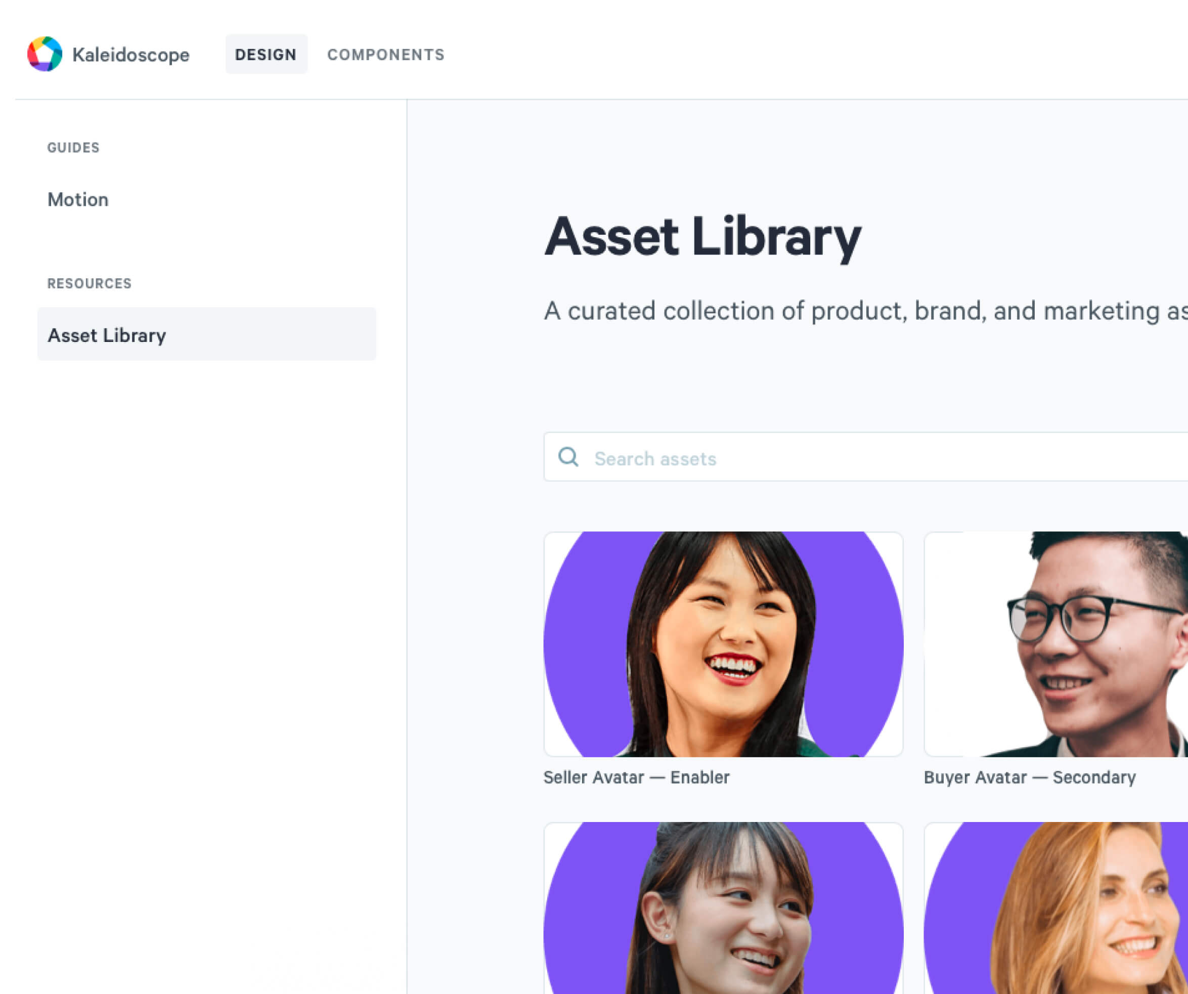
- A new shared library on Kaleidoscope for ready to use assets