House of brands, to branded house
Amp (formerly The Commerce Company) had acquired leading Shopify products, but wanted them to unify them under the same brand language. After raising $10m, Amp engaged me create a new brand that reflected their ambition, unique culture, and could scale and adapt to the journey ahead.
Creating a new brand strategy

Me
Design Director, leading workshops, strategy and design of new brand.

Laura
VP Marketing, lead the rebrand iniative, and how it fit into the broader marketing strategy.

Cameron
Founder, participating in workshops, and giving feedback on direction

Patrick
Founder, participating in workshops, and giving feedback on direction
Stakeholder interviews revealed three core goals of the rebrand — consolidate, create alignment, and standout. To hit these goals, I first focussed on creating a clear and concise strategy, to serve as the foundation for all creative work.
Discovery
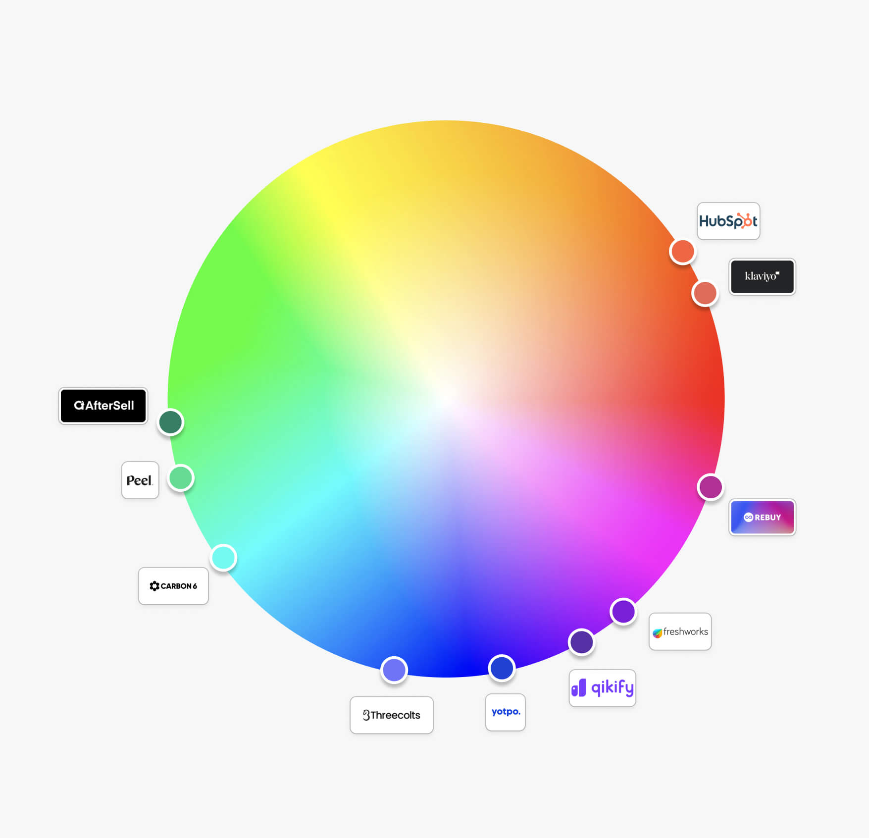
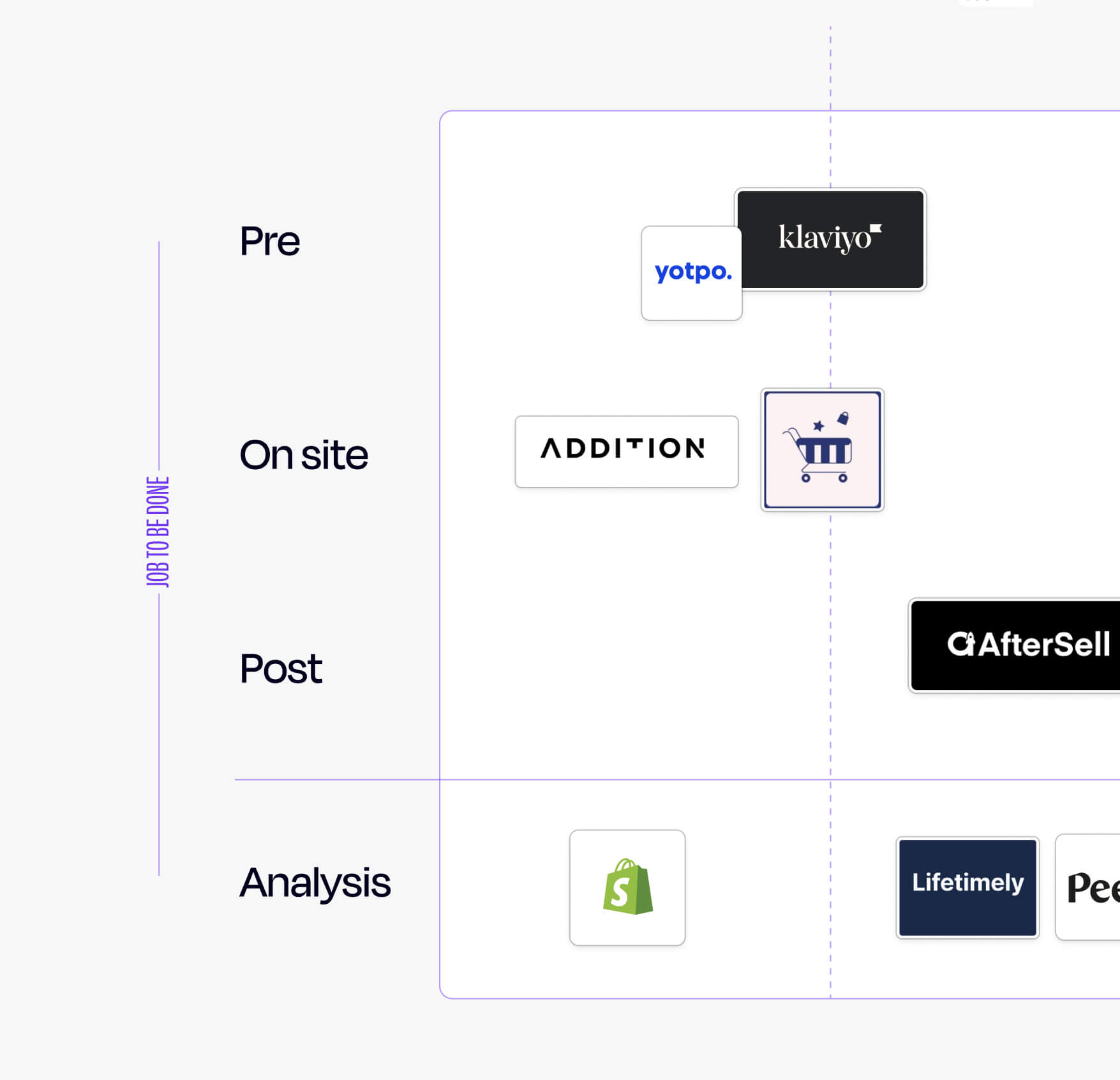
While the individual products in the Amp portfolio are in highly competitive areas, there were much fewer competitors for Amp itself. Competitors on the whole were hard to differentiate between in a sea of blue gradients. My initial workshop and discovery found opportunities to be more expressive, to cut through the noise, and differentiate on the foundations of JTBD.

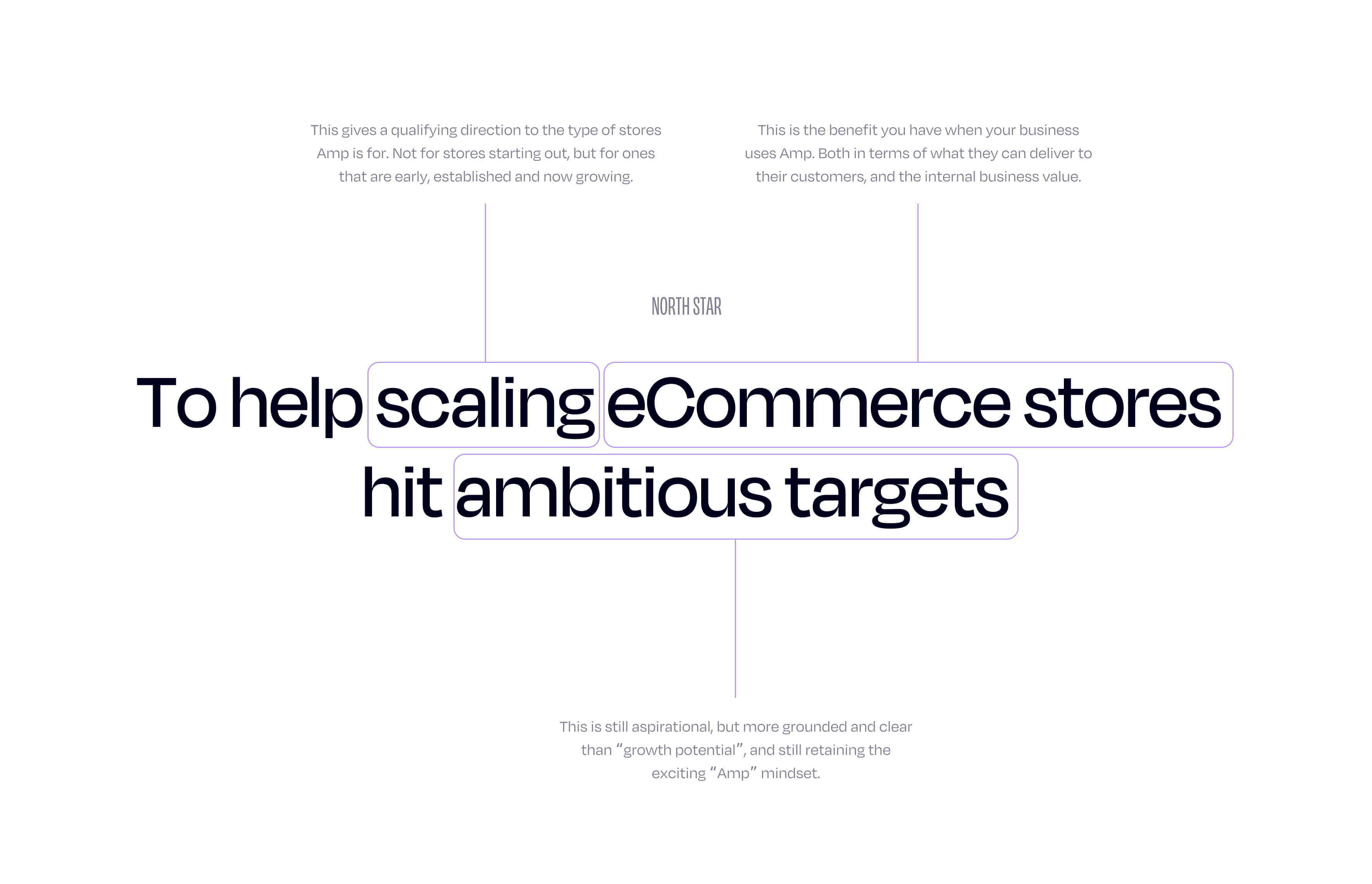
North Star
Leveraging insights from stakeholder interviews, workshops, and discovery, I worked to define an authentic, relevant and consistent North Star and brand narrative. These cornerstones of the strategy gave rise to the creative work, and informed the brand personality.
- Energising
- Direct
- Empowering
Creating the foundations
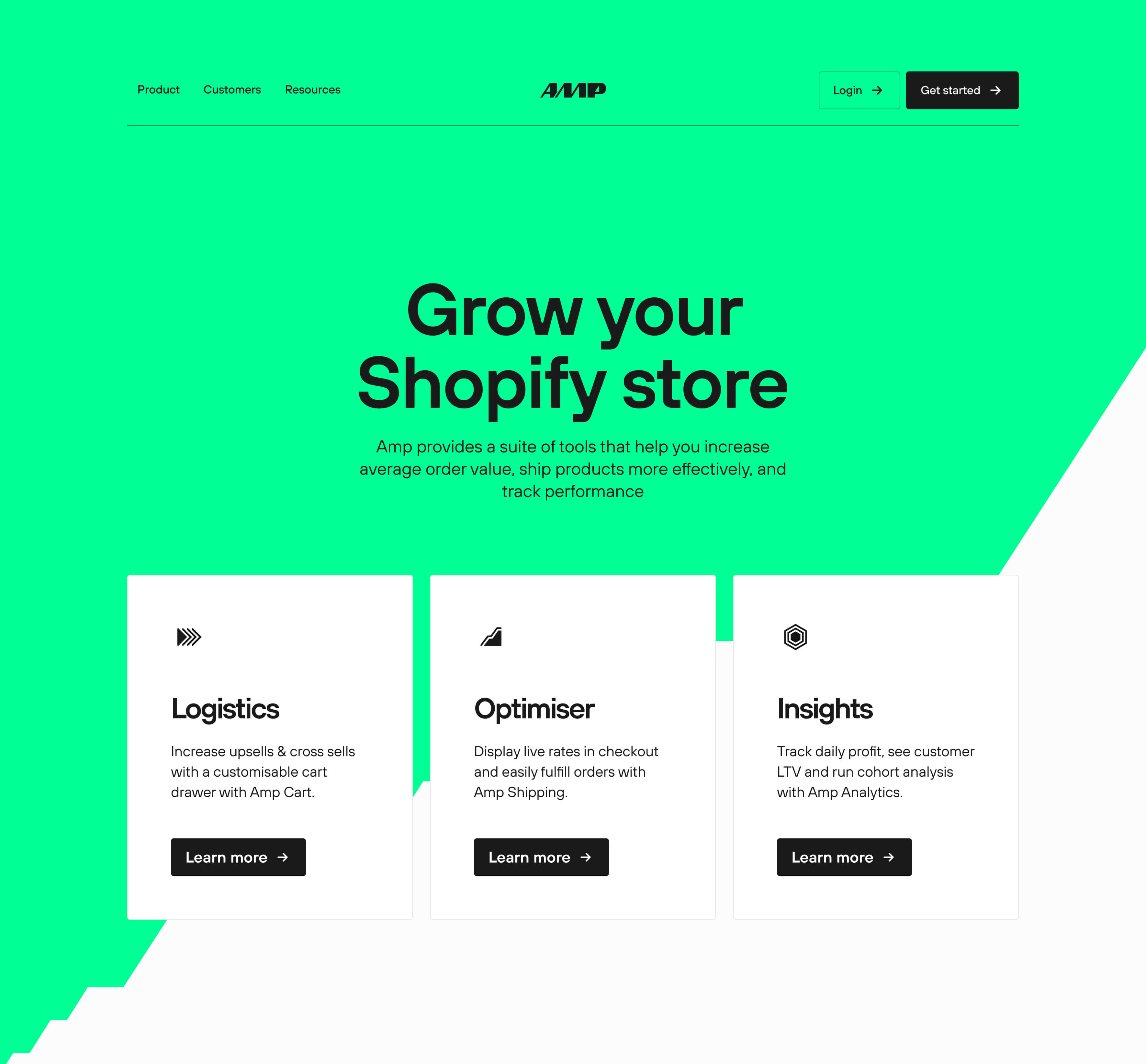
The Amp brand would live across a wide range of screen real estate — their own site, Shopify Marketplace, review sites — I designed the logo and colours to stand out at all sizes.
Logo
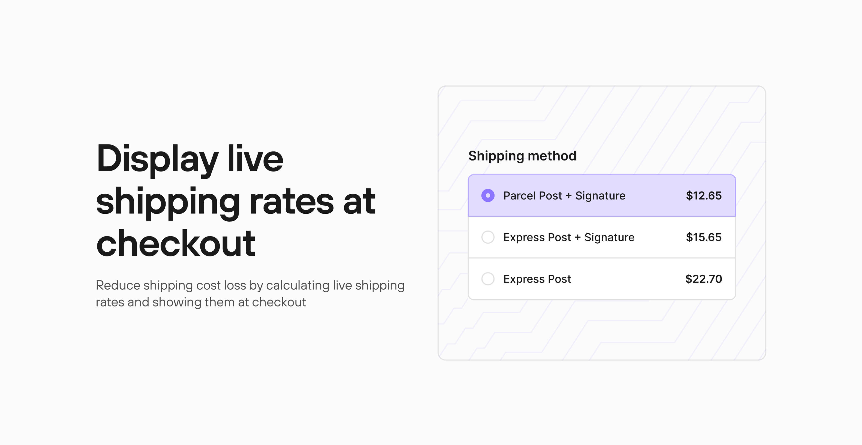
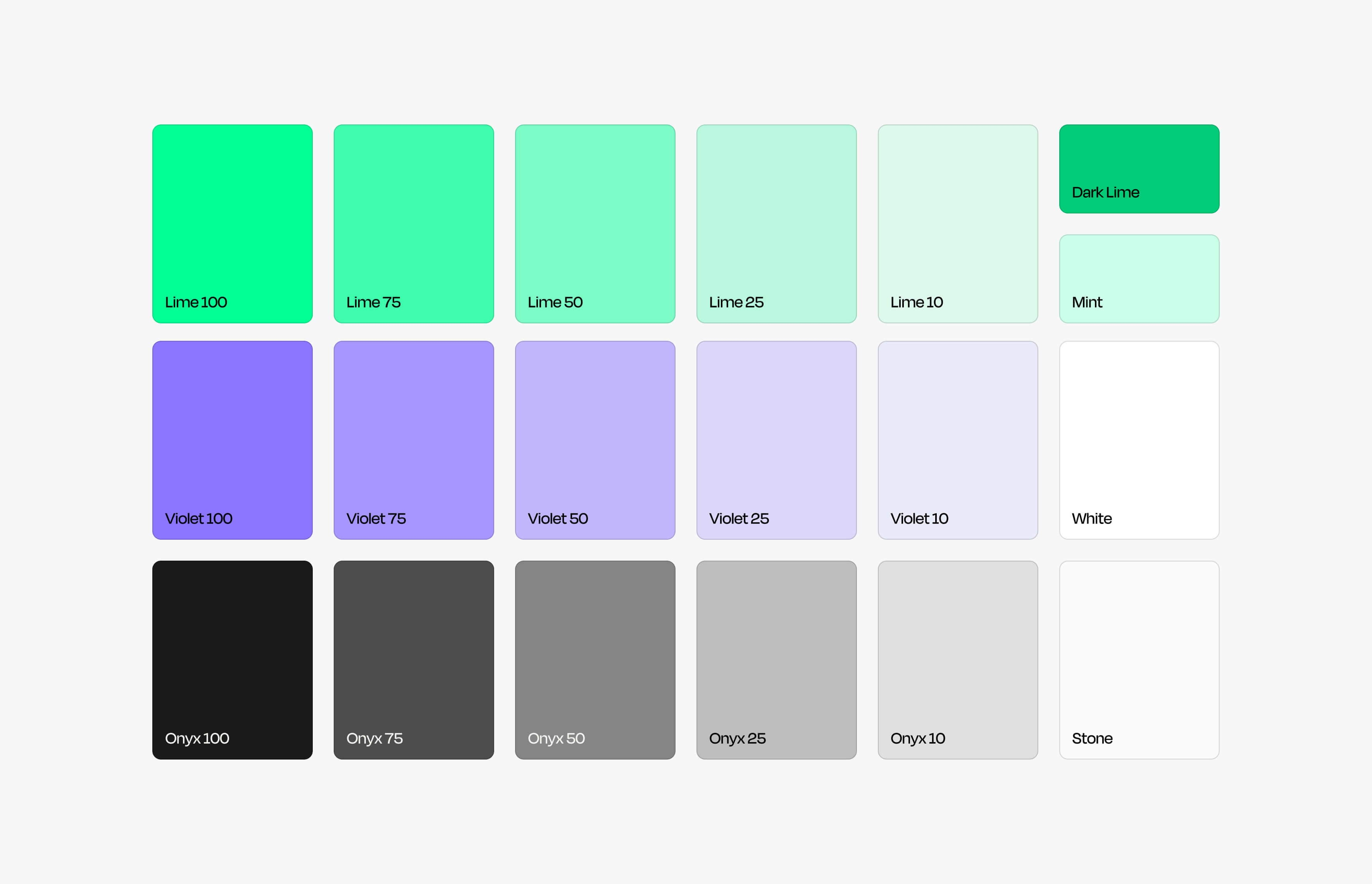
The colour palette needed to stand out from the competition, while also having a complimentary palette for product mockups. I created a vibrant lime palette for the brand, keeping a “dark lime” for accessible text lockups. Finally creating a violet palette for the “proxy” brand that is shown using and demonstrating Amp’s value in product narratives.
Core brand, proxy brand
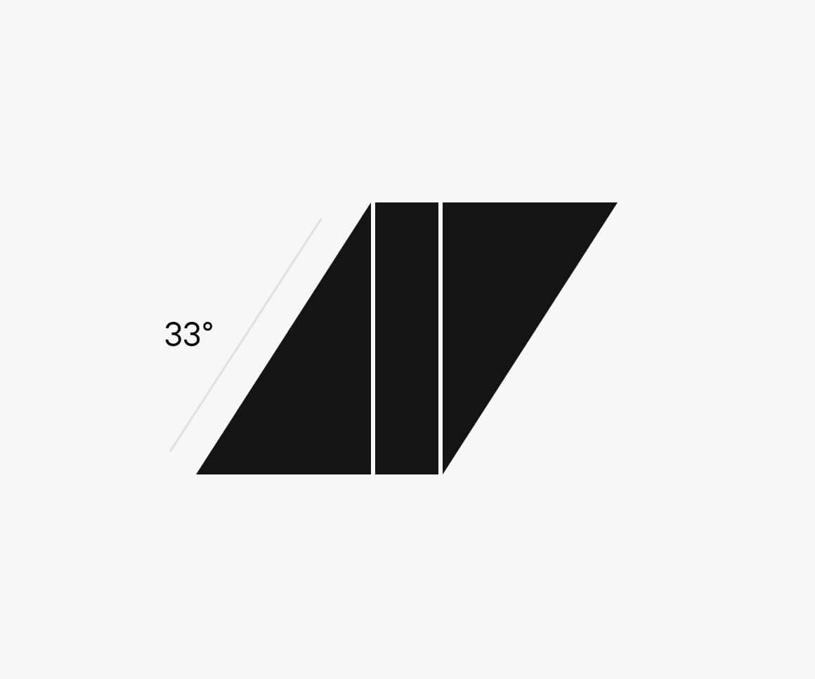
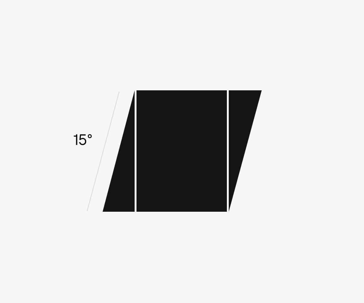
The logo needed to embody the new brand personality, work as a standalone logo, but not detract too much when in the presence of individual products. Every letter leans up and to the right, signalling progress and momentum. The profile of the A is also mirrored by the M, to create a sense of symmetry and rhythm.
Brand Design System
I created a brand system that could be flexible and adapable to work across a lot of go to market activities. Making it easier to create a lot of visual variety, without things feeling stale or repetitive.
Undercurrent, jolt, spark
These three elements acted as the backbone, delivering on the promise of the brand personality. The “undercurrent” used the same angle as the logotype slants, and could be used as a mask, repeated pattern, or standalone element. The “jolt” was the cutout from the A in the logo, and was used as a dynamic pointer for emphasis in assets. With the “spark” to highlight outcomes, milestones, or deals.


Masks
Amp needed to leverage a lot of customer content in case studies and spotlights. Working with the core angles of the logo, I created a collection of dynamic mask components in figma to make it easy to quickly created masked assets that felt on brand.


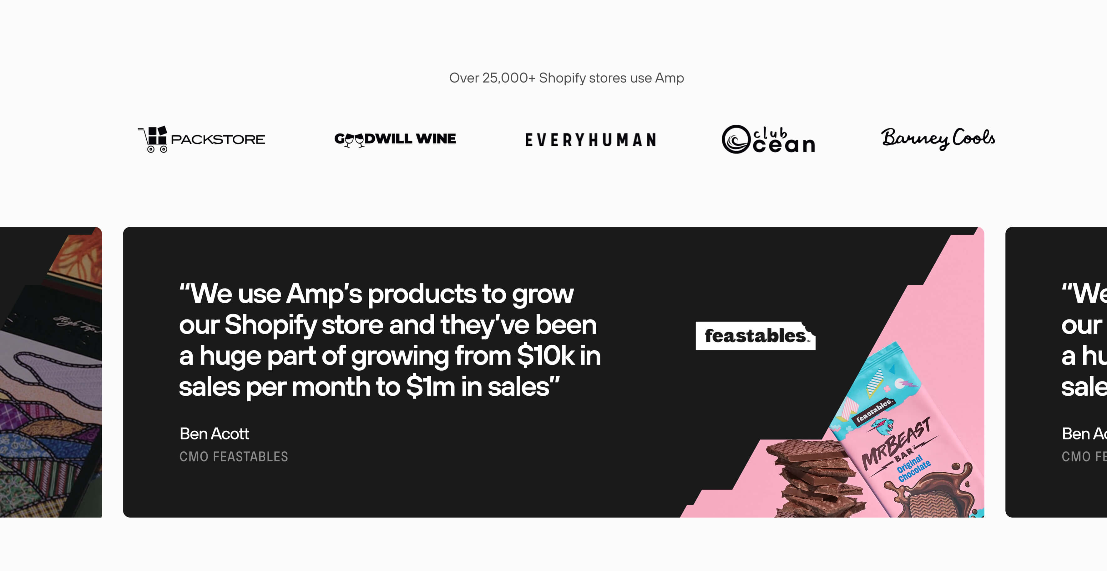
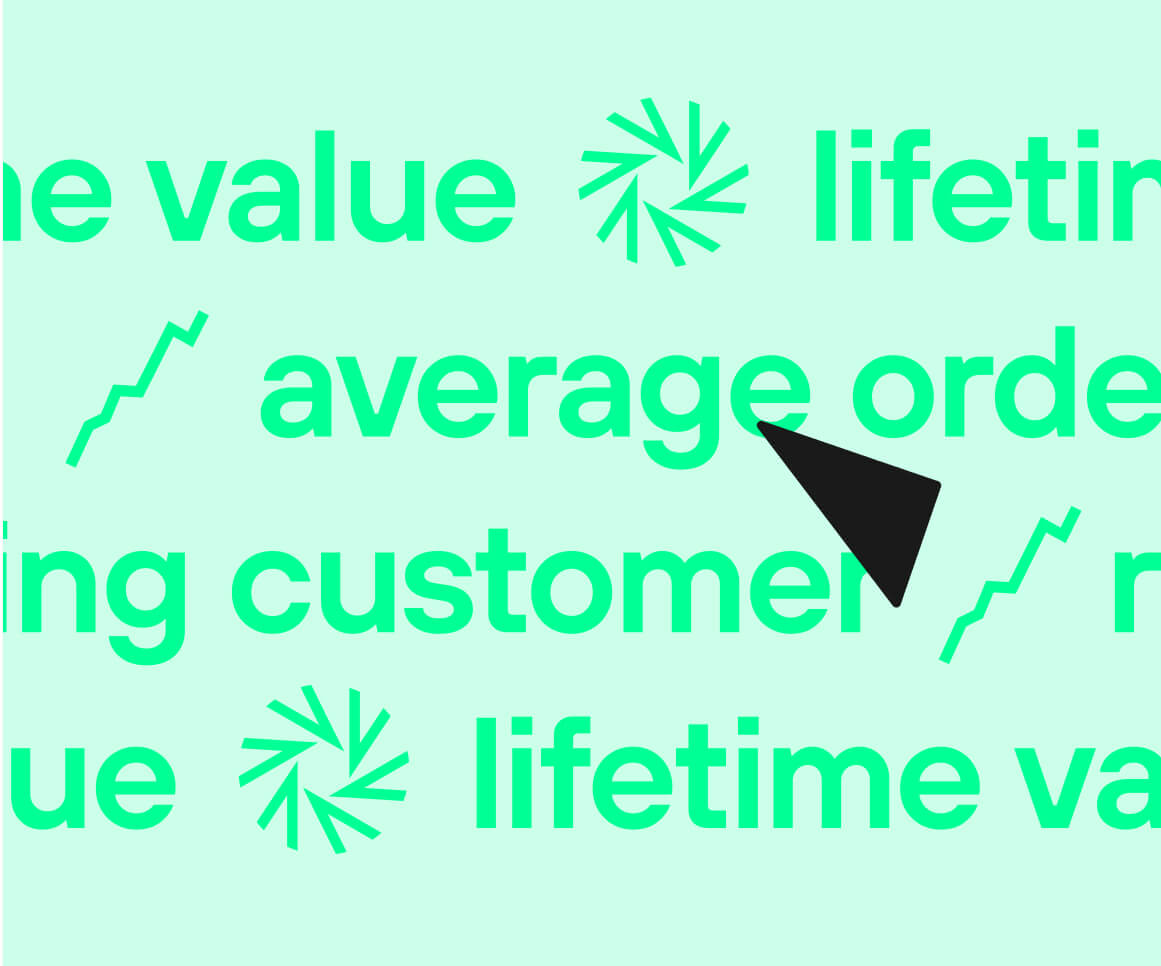
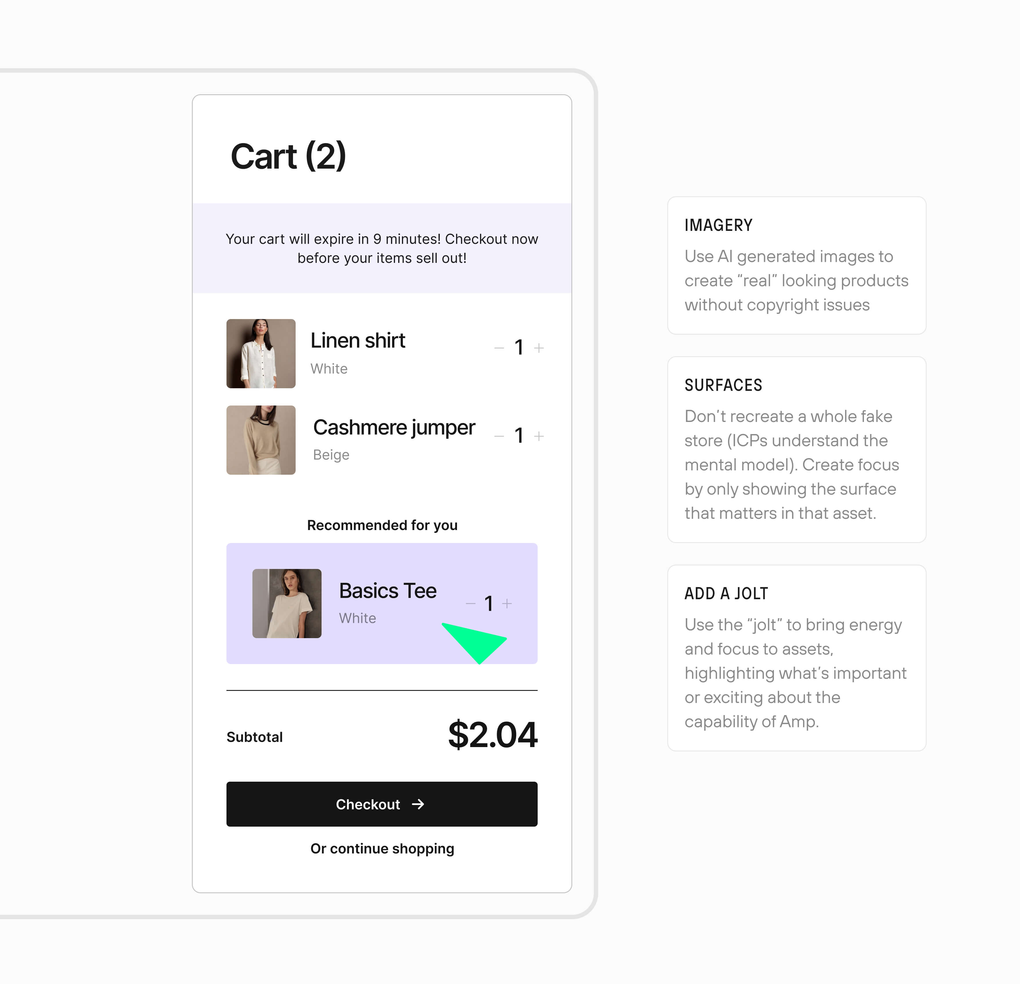
Product narratives
Amp had previously relied on screenshots, but to create consistent brand assets, I created new assets and wrote new guidelines on creating them from scratch, and on brand. Creating a few collections for use in emails, landing pages, and ads.
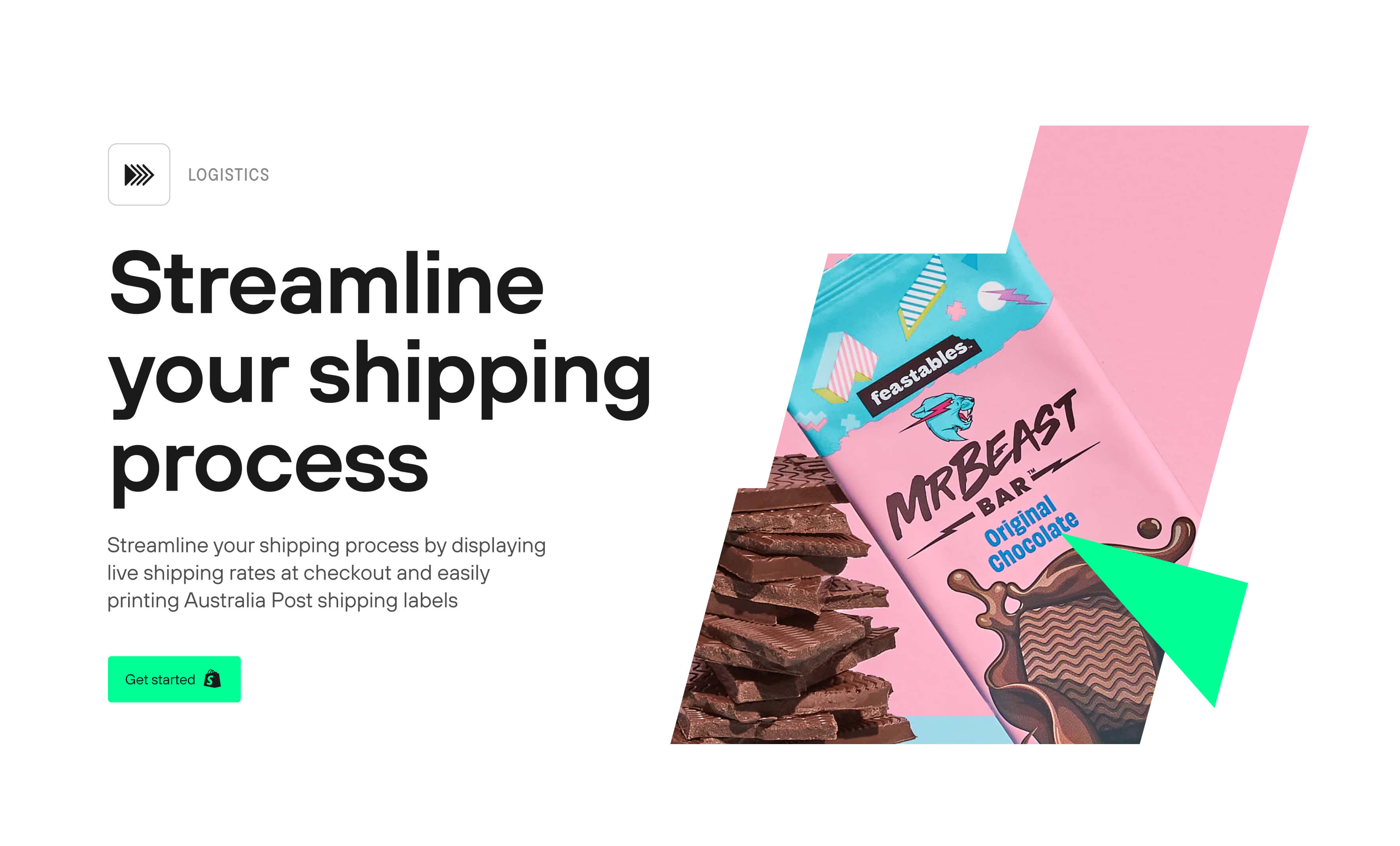
Putting it all together
The website was the first step in launching the new brand, to later be rolled out across individual products and satellite sites. Below are some snippets of the rollout at the time this case study was published.